Everywhen
A unifying insurance brand that makes business personal
Ardonagh Advisory was already a powerful force in the insurance sector. Part of the Ardonagh Group, it was home to a lively and growing network of respected brands covering business and consumer risk, with more than 130 offices and thousands of employees.
But with scale came complexity – and confusion. It was getting harder to explain who did what and how everything was connected.
This rapidly expanding business needed a new identity. But more importantly, it needed clarity. Cohesion. A modern identity that could unite people under one vision and show clients exactly what they could expect: expertise, partnership and support – wherever and whenever they needed it. And it needed to speak to a wide range of audiences spanning individuals, small businesses and corporate enterprises.
From everywhere to Everywhen
We were asked to create a new name and a single, defining brand for this new entity – one that would reflect the scale and professionalism of the business while feeling grounded, approachable and unmistakably human.
Our stakeholder research took us to the heart of the matter: despite the complexity, this was a business built on relationships and trust. Full of ordinary people with exceptional talents, working closely with clients and communities to keep things moving, whatever life throws their way.
Through a series of creative workshops, we landed on a name that felt both poetic and powerful: Everywhen. An uncommon twist on a familiar idea, the name captures the ever-present nature of insurance at its best – and the relentless dedication of the people behind it.
Everywhen describes the continuity, consistency and care that characterises the business. This is a brand that’s always there, in good times and bad. Built for the everyday and ready for anything.
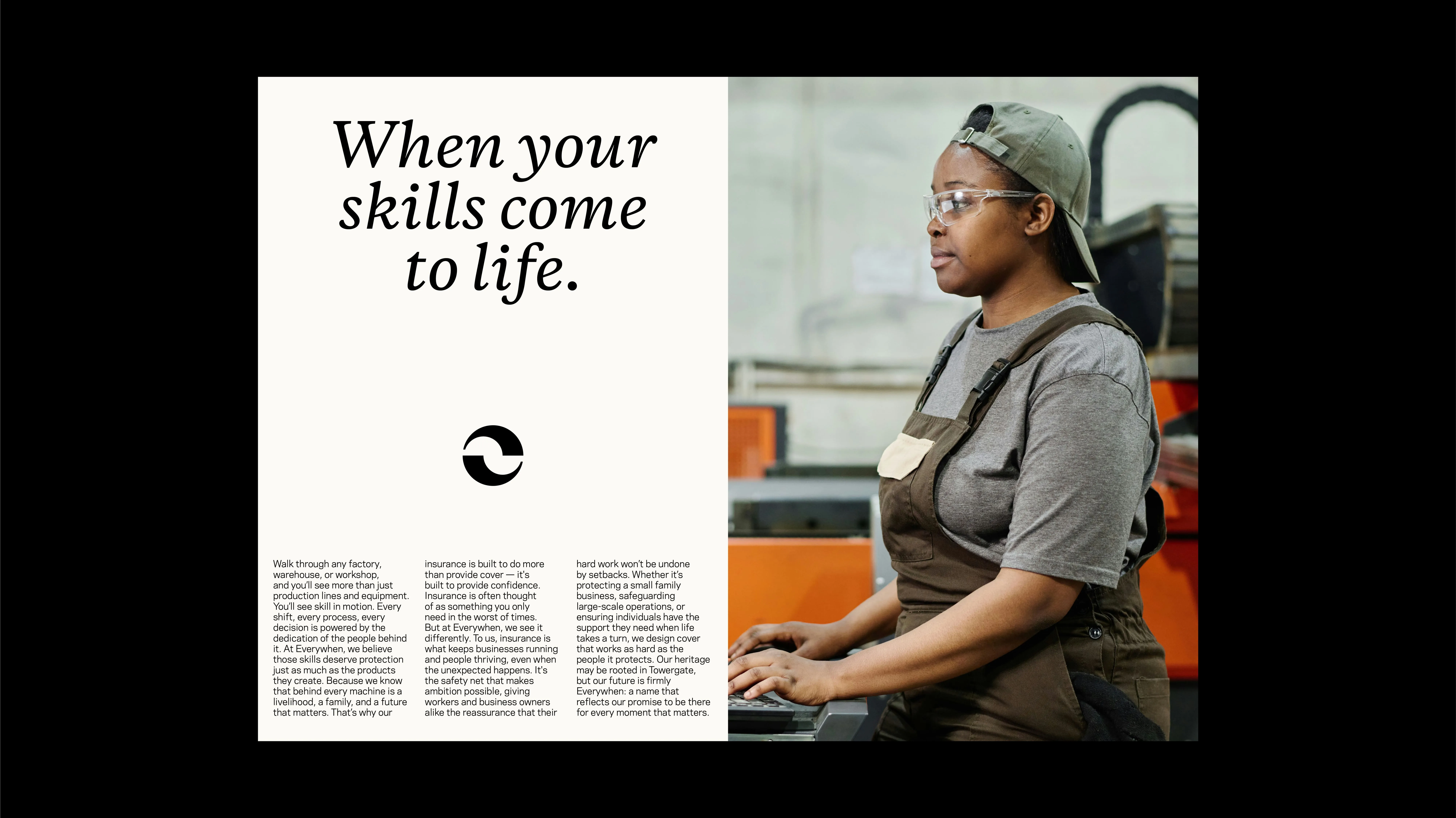
We took our lead from the name to develop clear and characterful messaging rooted in humanity, pride and partnership. Warm, yet authoritative; serious about risk, but never stuffy. Language that balances approachability with expertise – just like the people it represents.
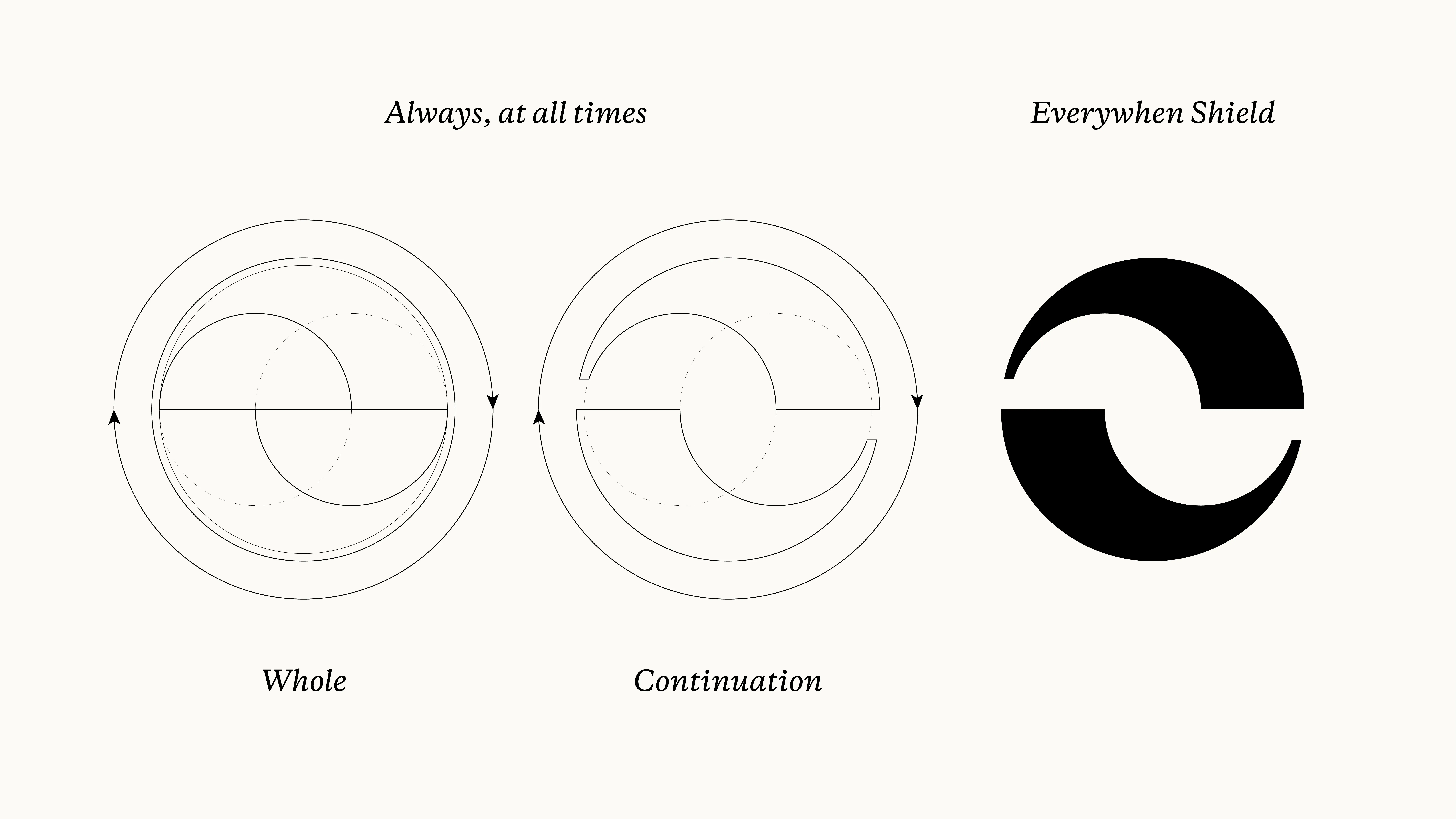
Circle of trust
Visually, we set out to build a brand that feels distinctively modern but unmistakably grounded in its heritage.
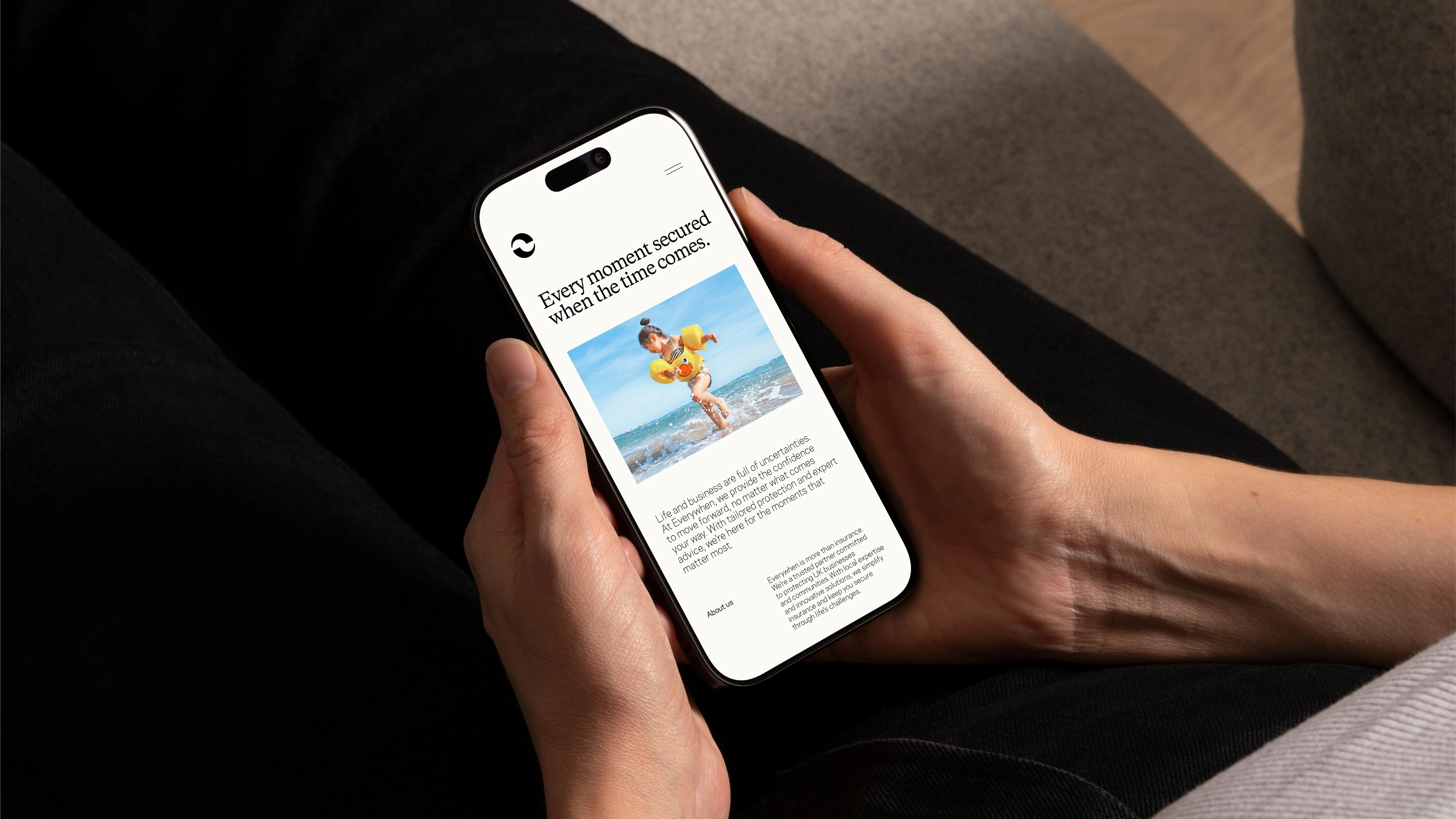
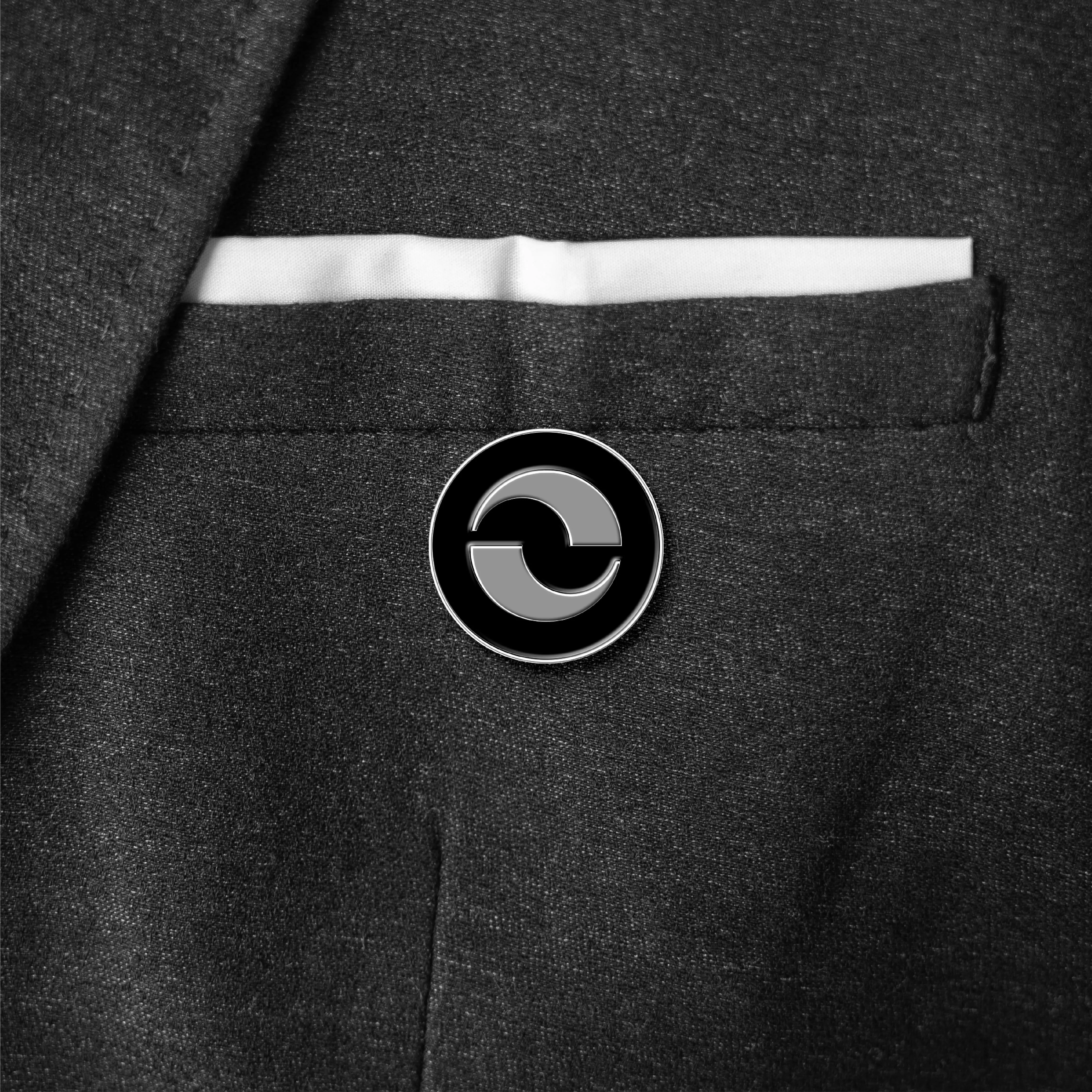
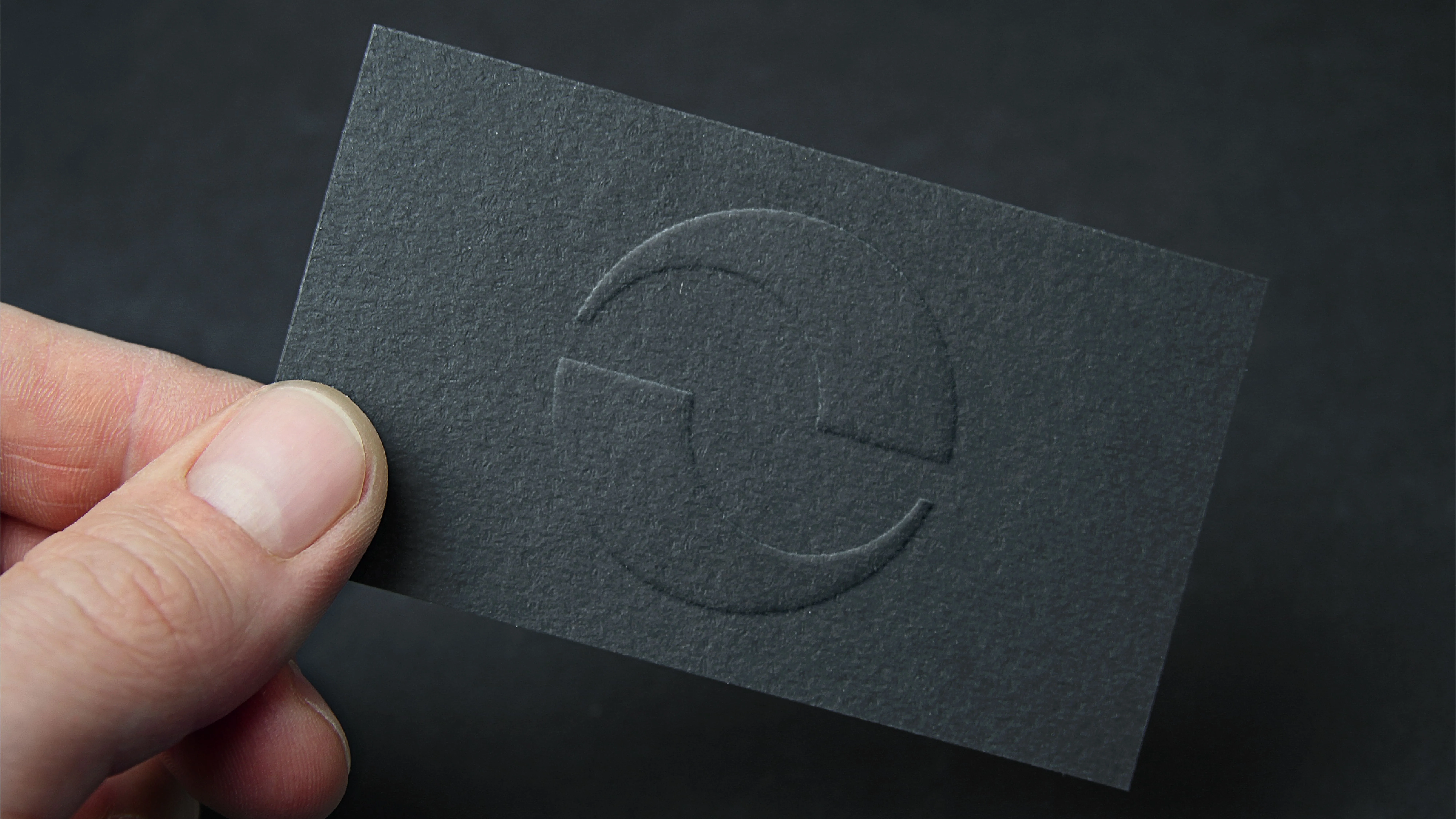
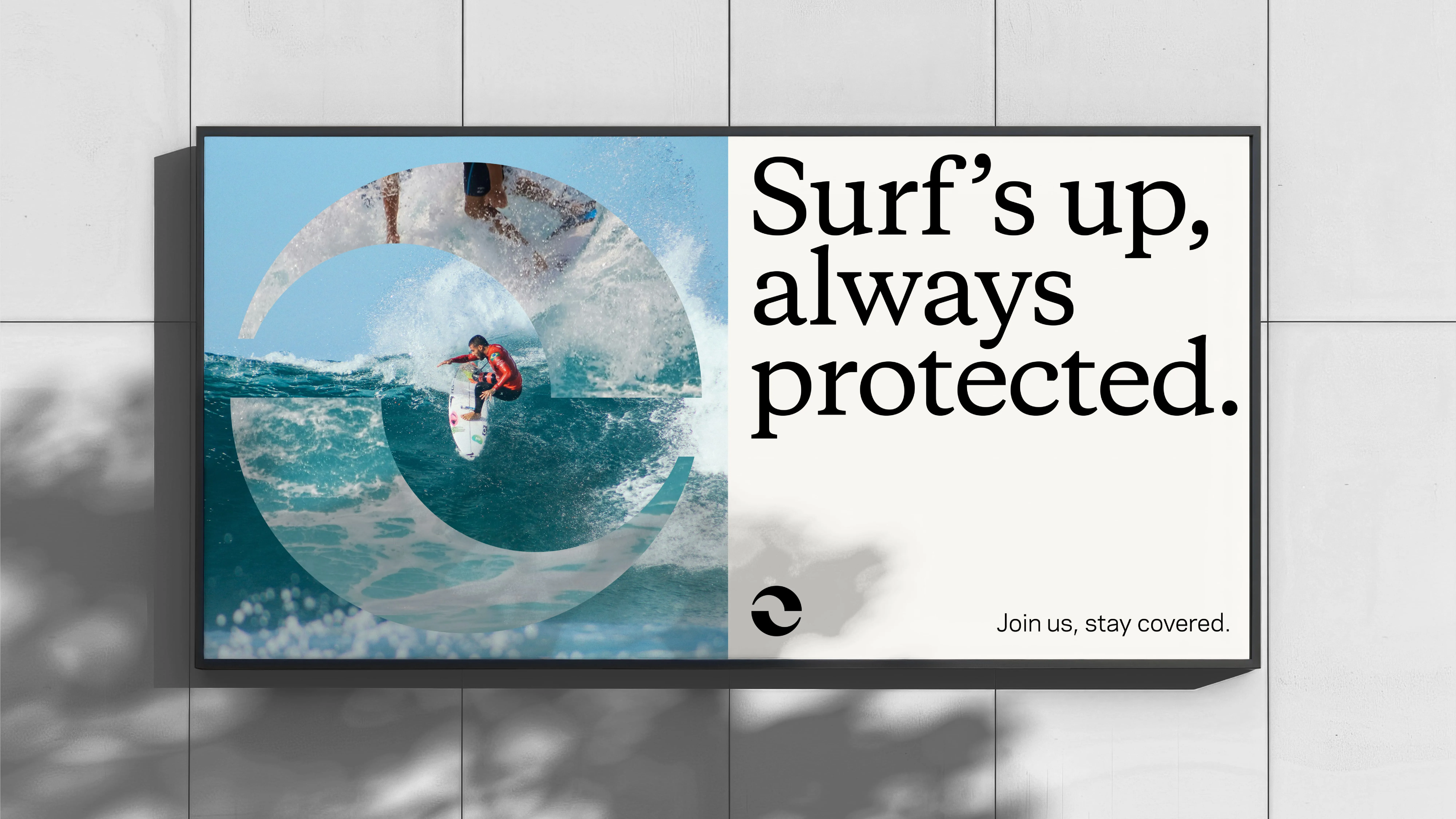
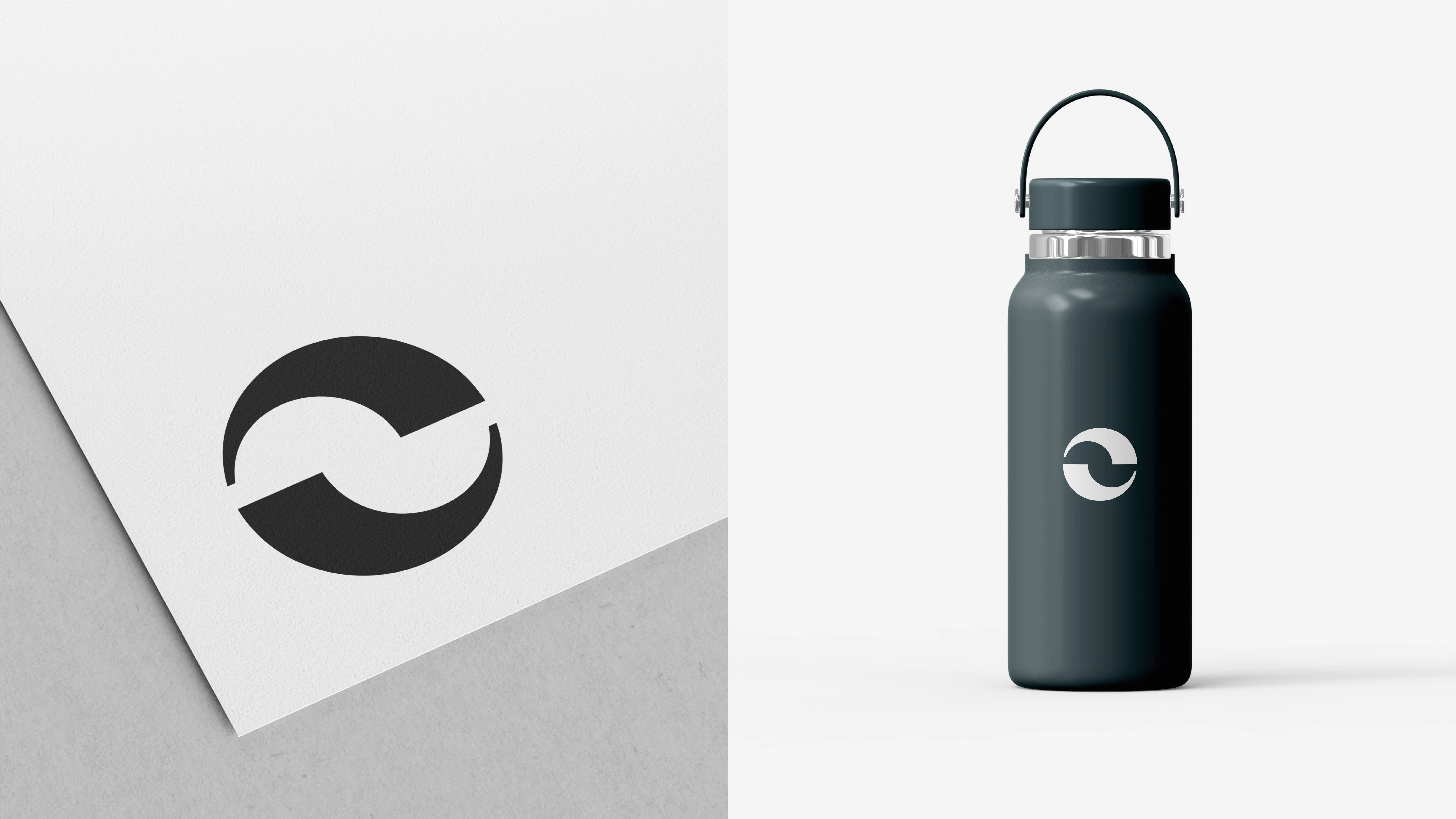
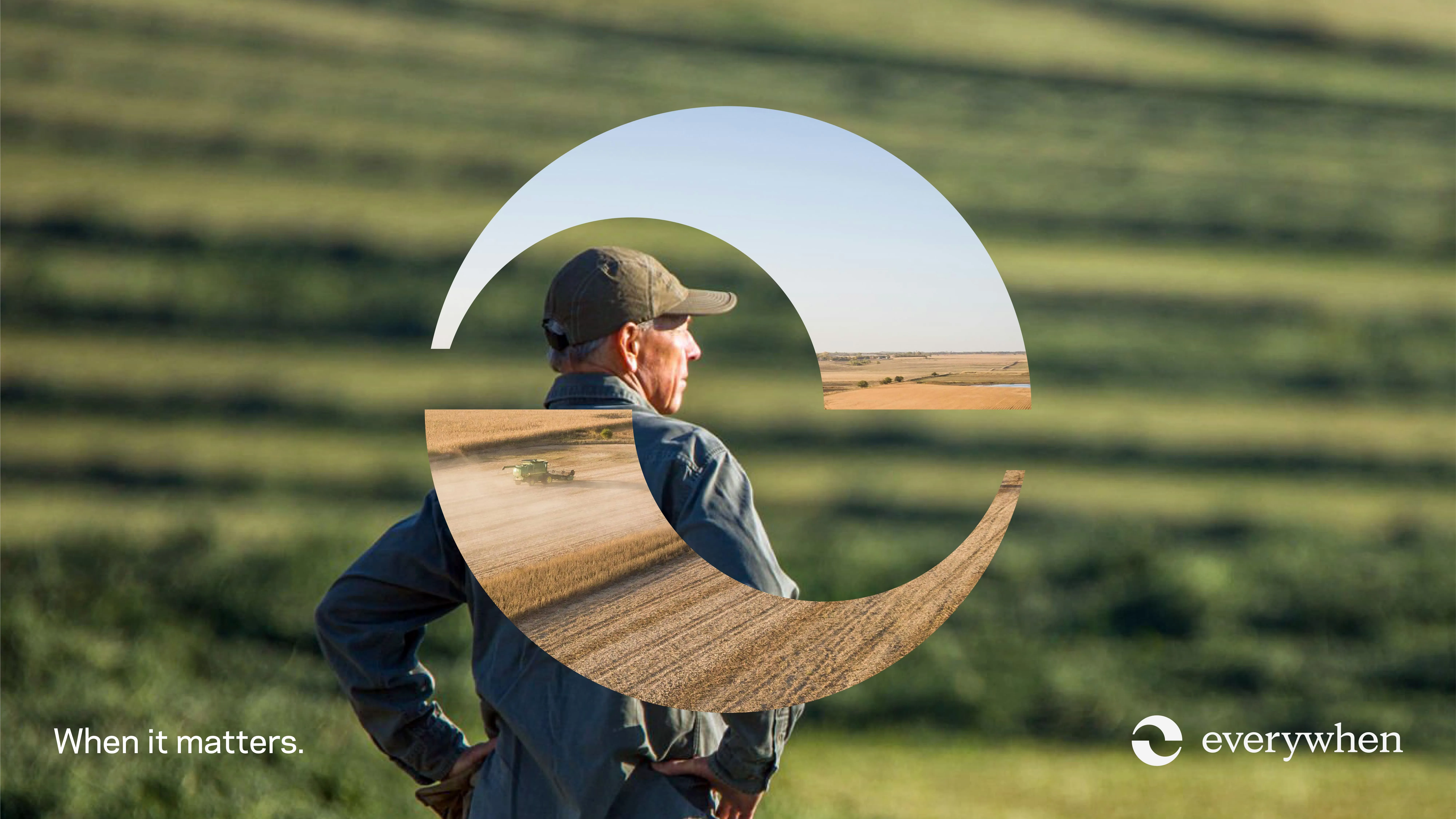
At the heart of it is the Everywhen shield. Formed from two looping shapes that resemble a lowercase "e", it represents protection, continuity and connection and offers a powerful visual shorthand for the brand. As a graphic device it can be used with photography as a frame or even animated to tell rich stories about the human impact of Everywhen’s work.
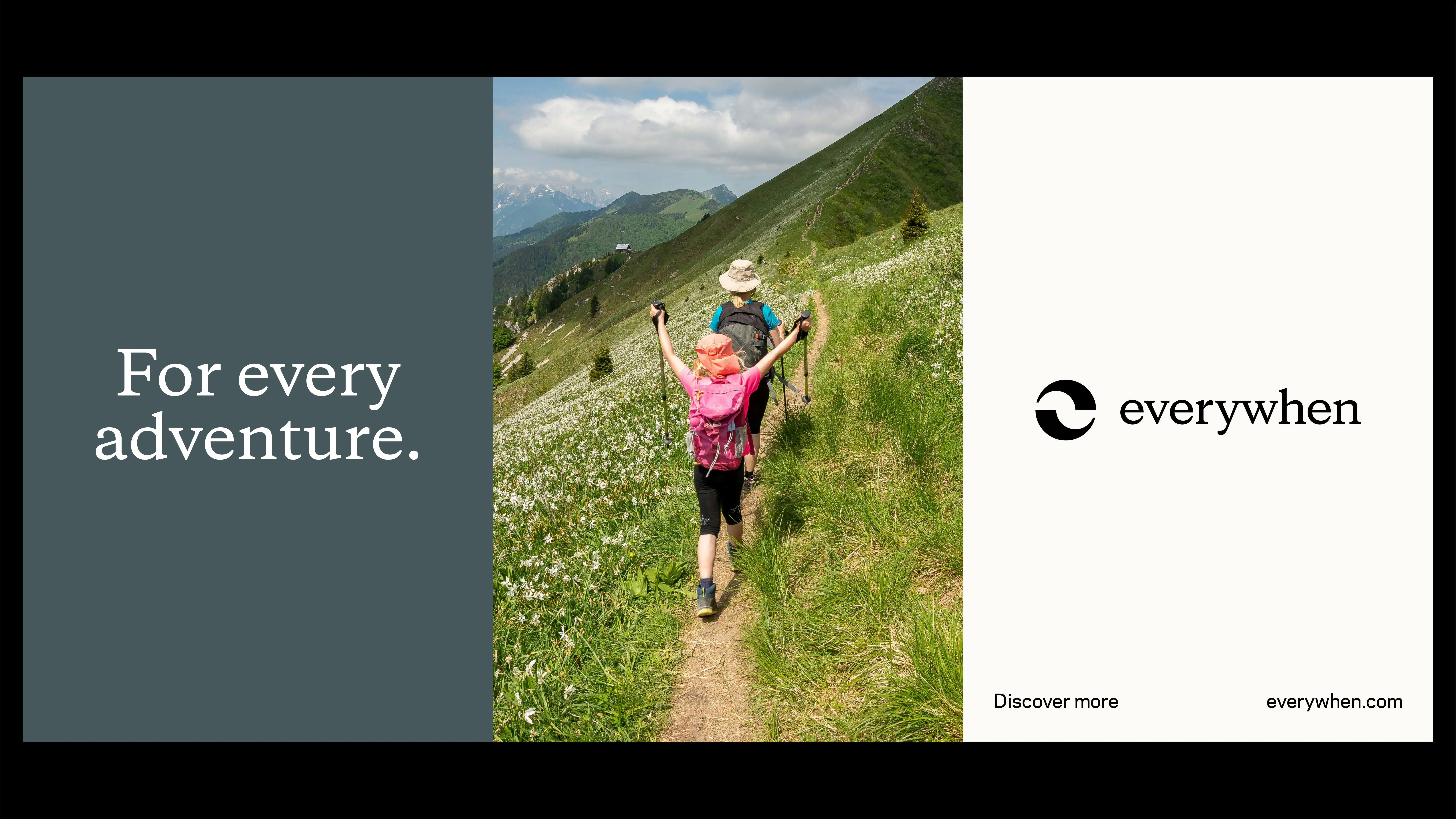
We worked with typeface specialists Dalton Maag to develop a refined serif wordmark, where the flow between the "y" and "w" reflects unity. It’s instantly recognisable yet quietly confident, a breath of fresh air in an industry where so many brands play it safe.
Purpose-led pictures
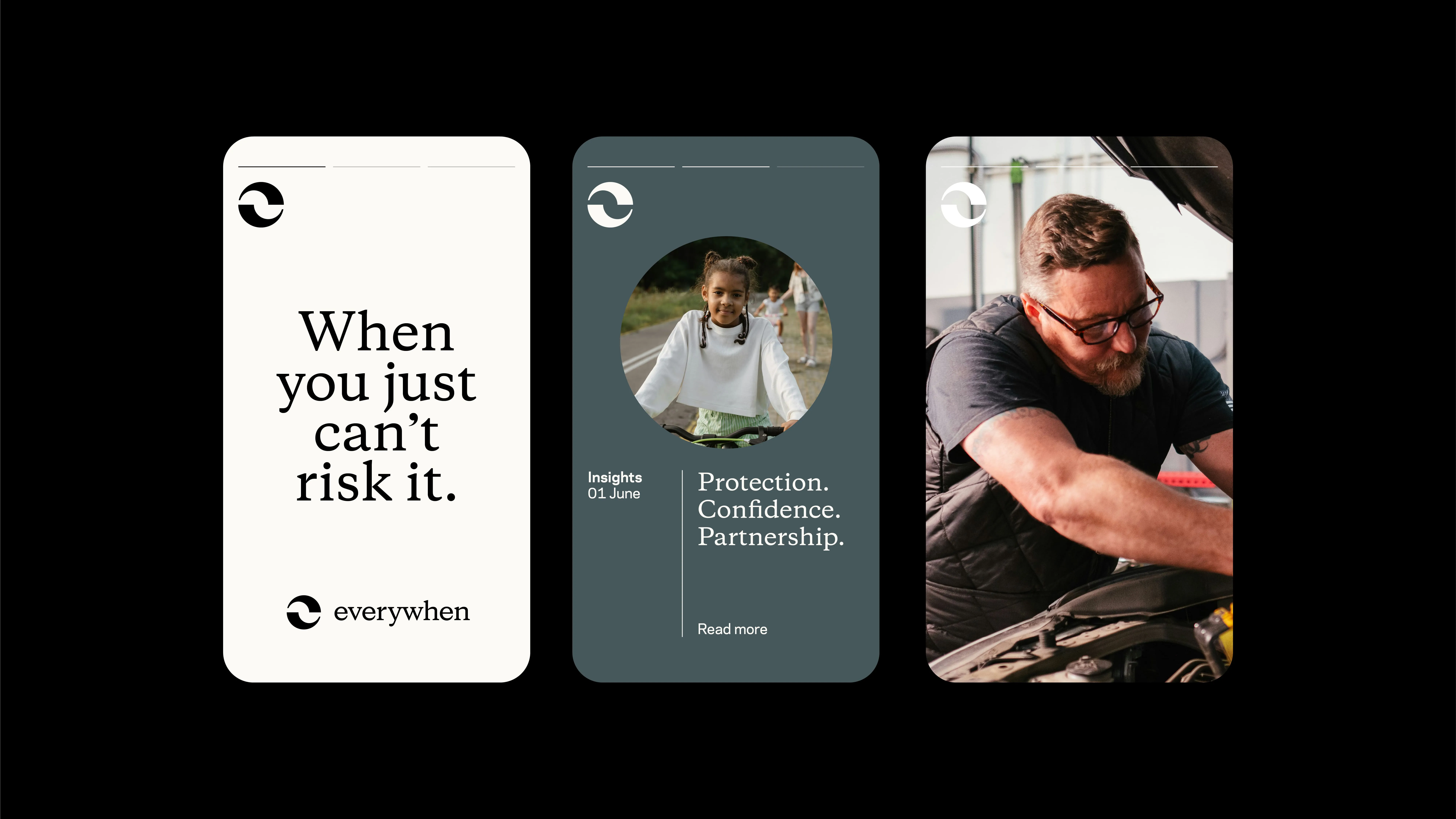
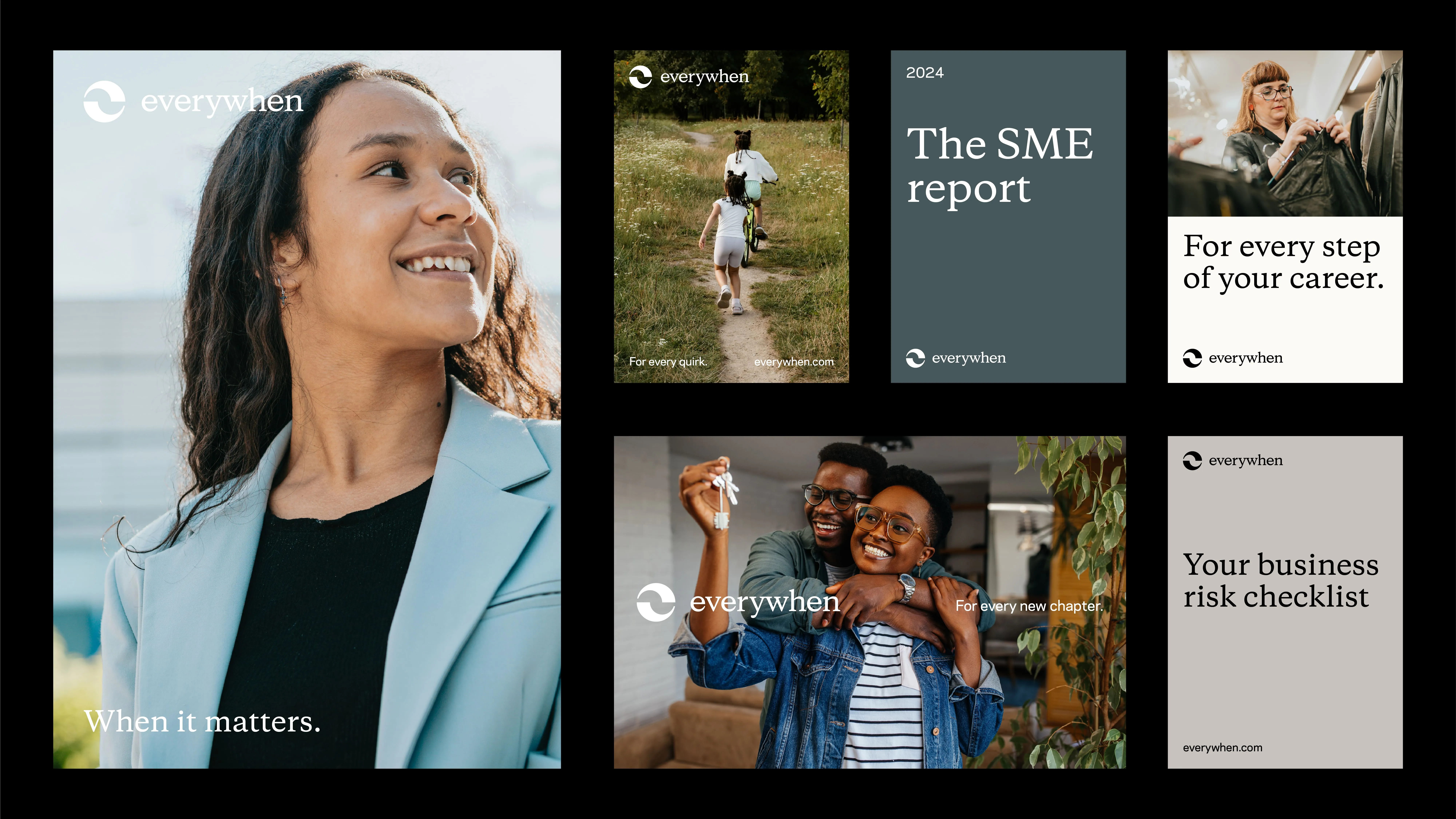
We experimented with authentic, story-led photography, proposing an approach that features clients and communities in real environments, always through the lens of the Everywhen shield. From small business owners to family-run farms, we wanted to showcase moments of action, ambition and care elevated by strong composition and warm lighting.
Our custom iconography echoes the curves of the shield and the elegance of the brand’s typography. It’s a subtle but powerful way to create cohesion across touchpoints, reinforcing the distinctive Everywhen feel at every level.
Roots and reach
For the colour palette, we took inspiration from durable materials and the UK’s natural landscape, acknowledging the brand’s presence and consistency. The core tones bring calm, balance and maturity, while an extended palette adds depth. It grounds the brand in familiarity and heritage, reinforcing the idea that Everywhen is built to last.
To strike the right balance between professional and personable, we chose a refined serif: Copernicus. It brings clarity, gravitas and distinction when paired with Polaris, a tactile, modern sans that adds openness and legibility.
Identity and pride
For a business of this scale and legacy, rebranding can never be just about optics. Everywhen employees now have a brand they can stand behind with pride and a decisive platform with which to communicate their value to clients and communities.
From naming and narrative to design and delivery, we brought Everywhen to life as a brand that doesn’t just sound like insurance – it feels like protection. It’s modern, meaningful and made to last.
It’s business. And for Everywhen, it’s always personal.
“I loved the challenge of creating a narrative for a brand that was essentially a blank canvas, but underpinned by a really rich history and so many brilliant client stories. I love how the design and messaging work together to create something that really stands out in insurance.”
Louise Sheeran, Content Director
