Inver ReA new player in reinsurance

Service
  1. Brand strategy and identity
Industry
  1. Insurance

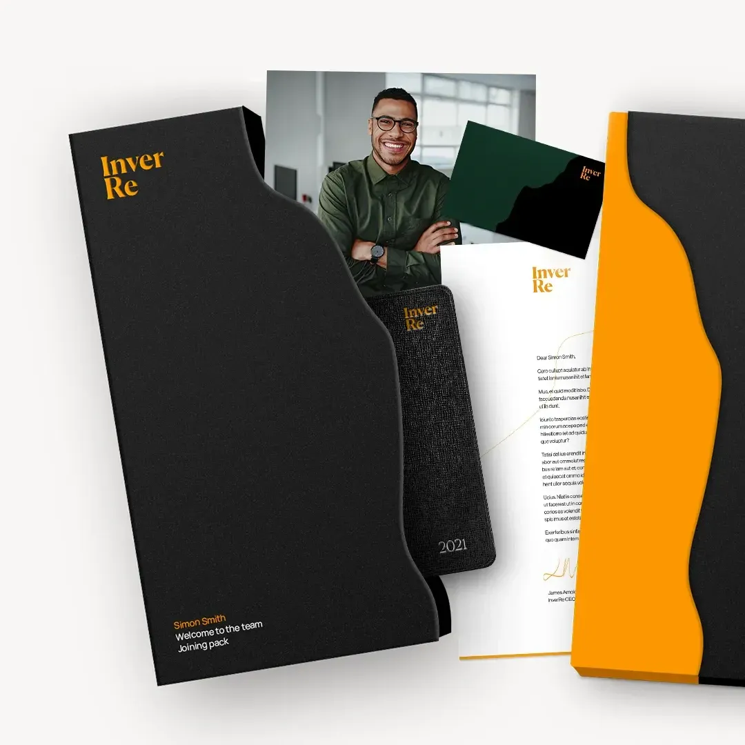
We designed the brand identity for a new specialist reinsurance broker in The Ardonagh Group’s portfolio. The new business was set to offer a progressive, credible alternative in a market where choice had become increasingly limited. It needed a name and a brand to match.
One of the world’s leading independent broking groups, The Ardonagh Group wanted to add a new reinsurance business to its portfolio. It hoped to offer a fresh alternative to the “big two” traditional reinsurance providers by launching a more consultative, boutique brokerage that would help insurers to balance risk in more strategic and flexible ways.

Our brief was to position the launch as a new era for reinsurance and create a brand that told a story and had international appeal. We also needed a visual identity that captured the freshness of the brand and – in particular – would attract reinsurance specialists looking to take a job with an alternative broker.

A future with strong foundations

We talked to stakeholders across the existing business to gain a clear picture of how the new brand would fit into Ardonagh’s portfolio, how they wanted it to be perceived and the market gap it was set to fill.

While the reinsurance business was completely new, we realised the brand had a strong foundation in its parent company that shouldn’t be ignored. Ardonagh’s name is a combination of the Gaelic words for “on high” and “warrior”. The name we proposed, Inver Re, draws from the same tradition: “Inver” is derived from the Gaelic word for estuary, the point where a river flows freely into the sea, while “Re” gave the firm a clear identity as a reinsurance business.

The Inver Re name speaks to openness and connection to the wider reinsurance market, while delivering a subtle nod to The Ardonagh Group. The brand proudly serves its heritage with a twist.

Timeless yet fresh

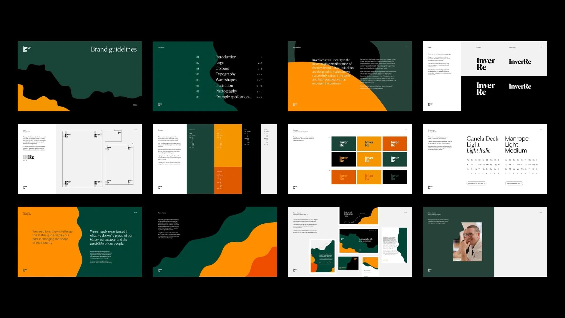
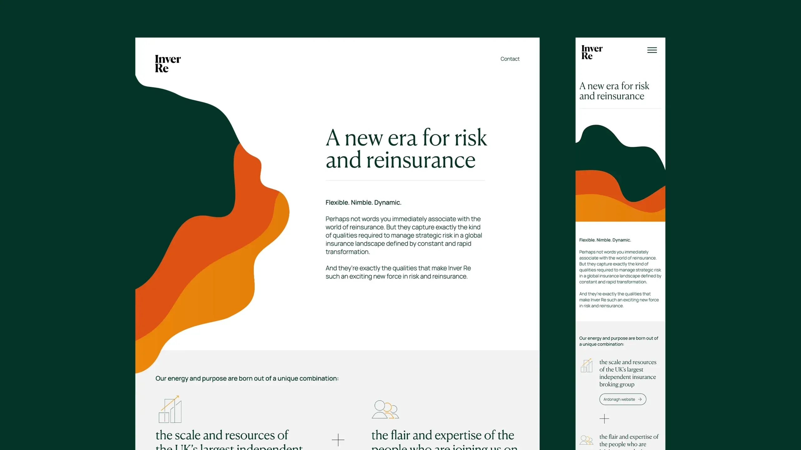
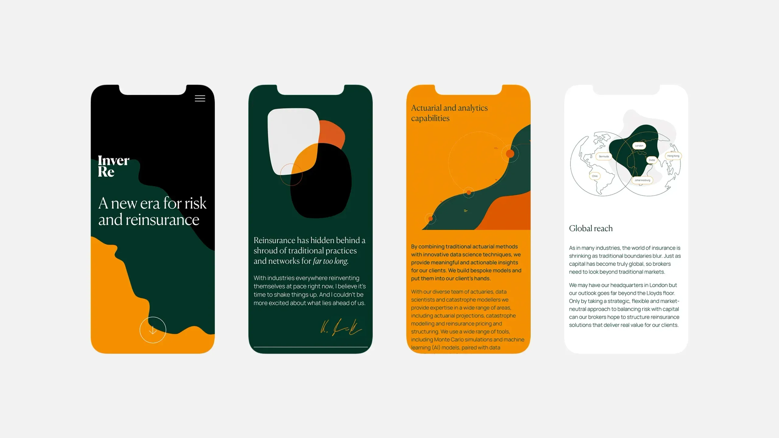
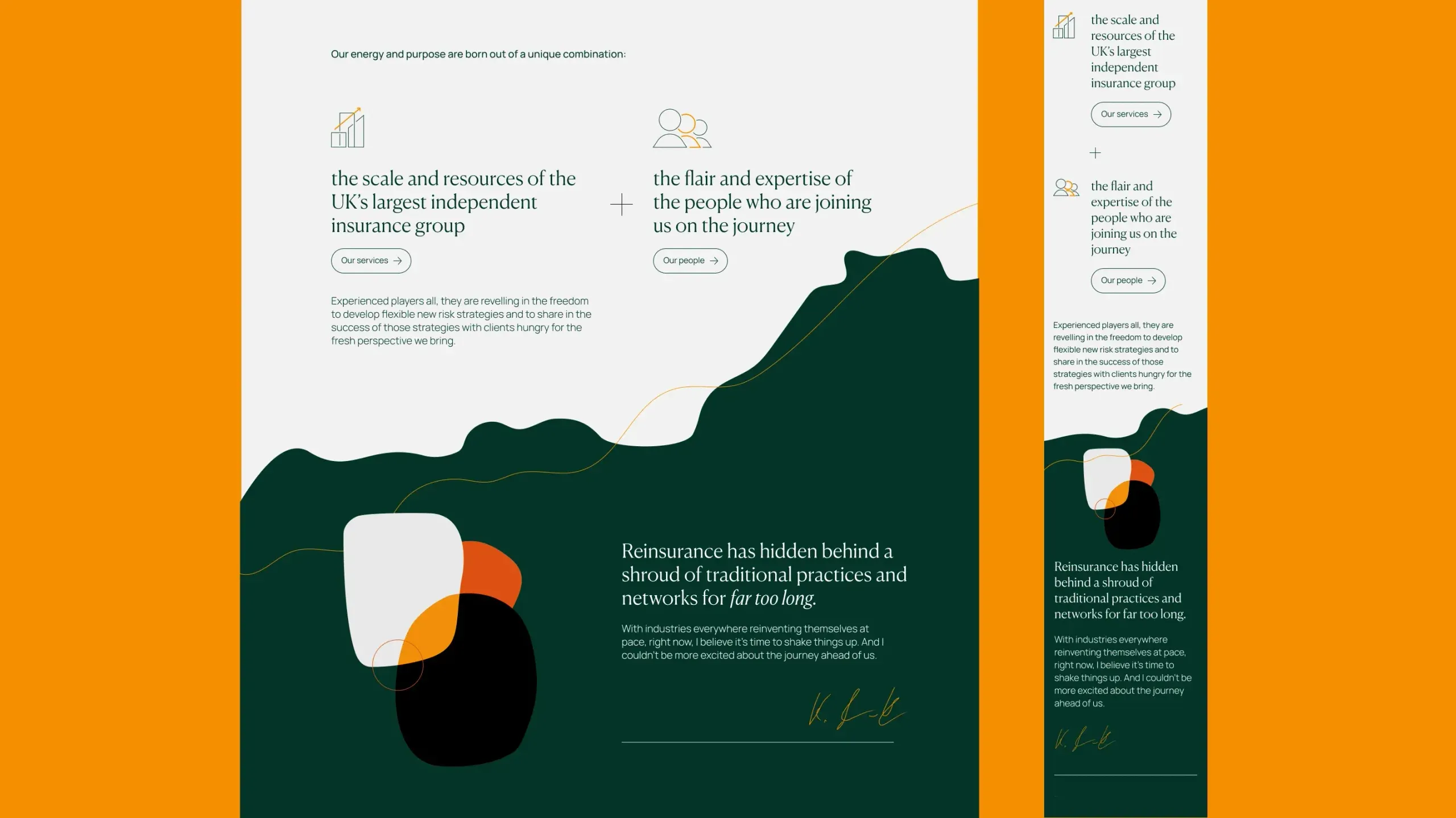
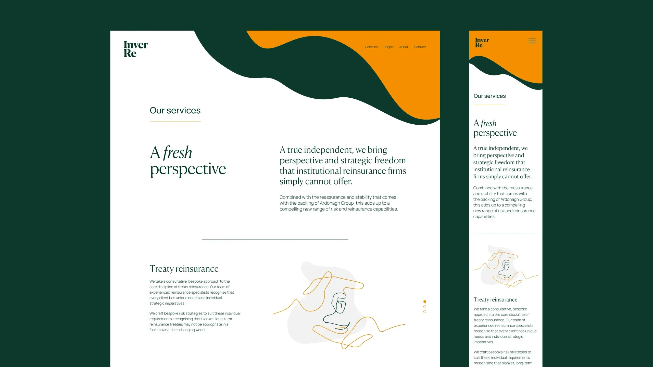
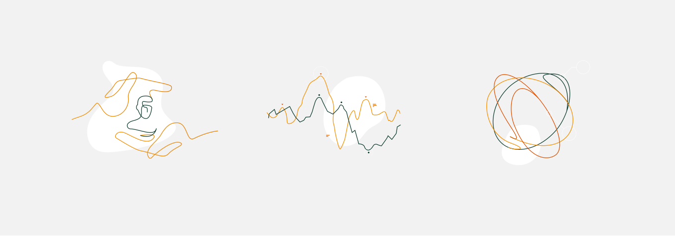
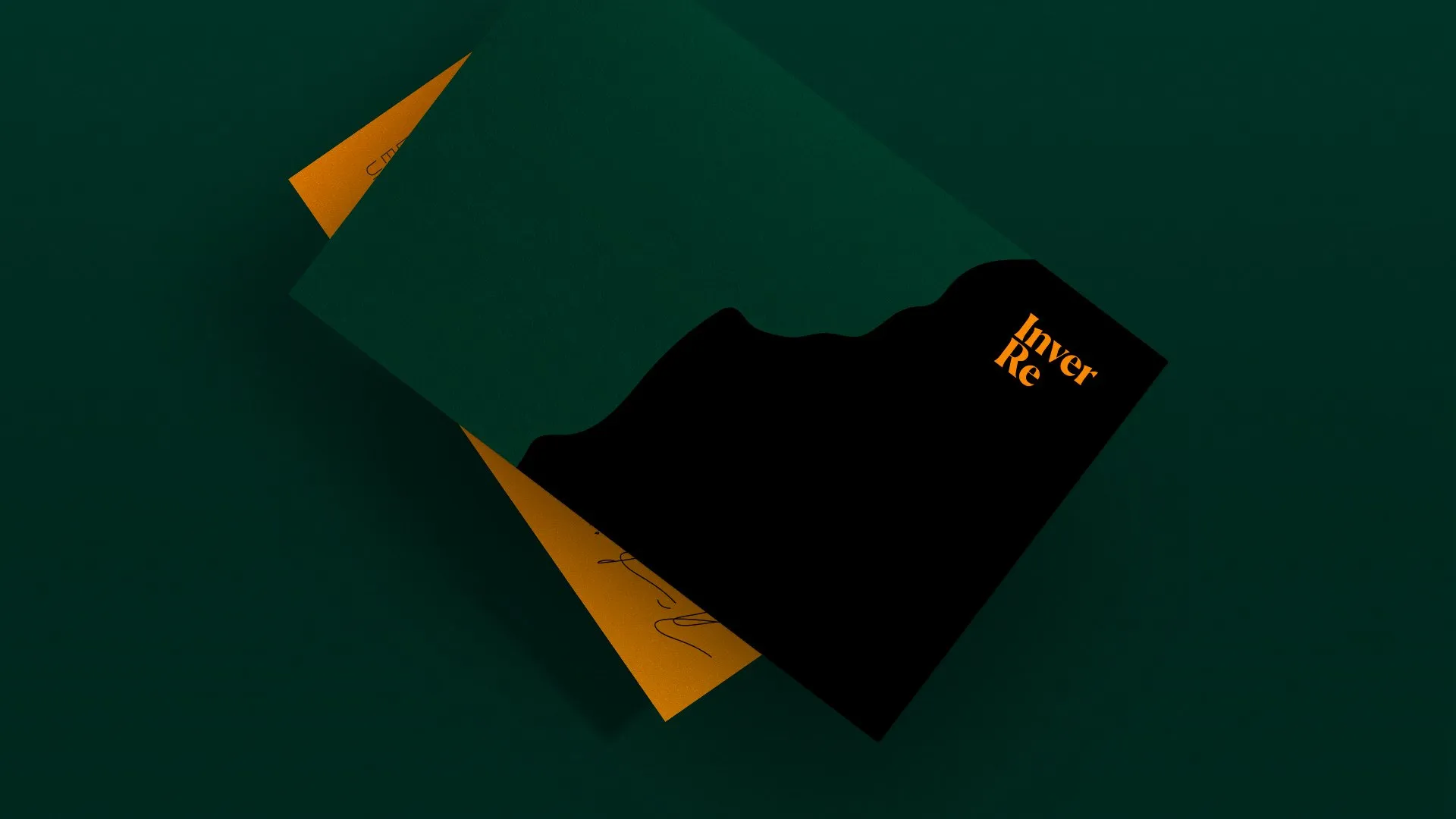
We carried the estuary theme through to Inver Re’s visual identity. We used curved lines and layers inspired by geological features like estuaries, as well as rock formations and shorelines.

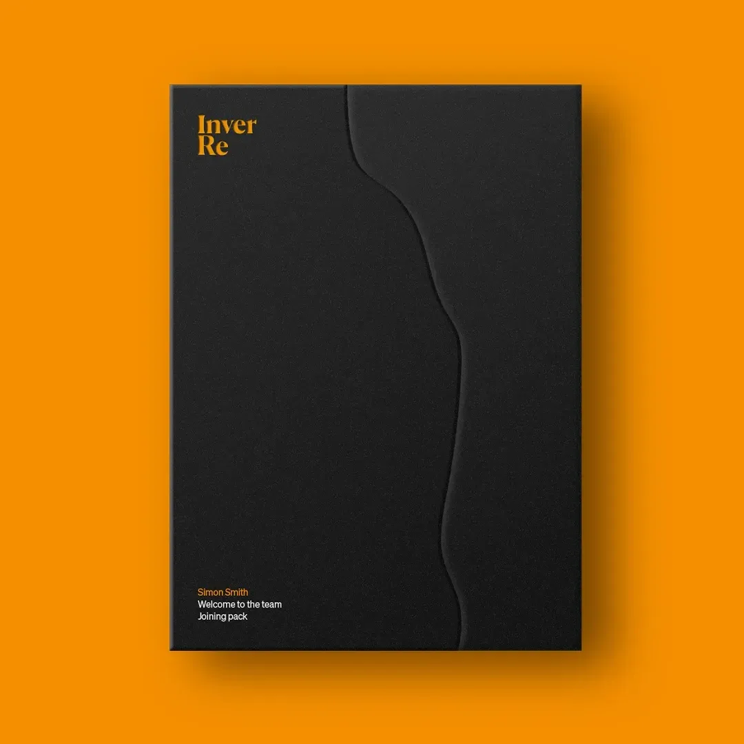
We strengthened these bold, organic shapes with earthy block colours that stood out from the typical corporate colour palette.

The result is a brand that feels timeless yet fresh. Unassuming, with a quiet force. Familiar, but flowing and flexible. Inver Re is a confident new player, ready to make waves.

Related thinking

Upside-down black calculator displaying digits that spell the word LESSONS on its screen.

The problem with playing it safe

When the most risky thing to do is to play it safe, you’ve got to be bold and take some calculated risks.

James Trowman, Partner and General Manager

A webpage mockup for Frame of Mind featuring a central stylized letter F logo and a search bar with the query "Strategy is" displaying a list of autocomplete definitions.

Strategy is complex, but winning brands keep it simple

Brand strategy can seem daunting and complex – and bringing the right stakeholders and insights together can certainly be an involved process. But keeping the final output simple and direct is rarely going to be a bad choice.

Ben Bush, Partner and Head of Strategy

See all thinking ↗