Price Forbes
A bold brand for a new era of insurance
When the Ardonagh Group consolidated four high-performing brands under the Price Forbes name, it needed a strong identity to capitalise on market opportunities and attract talent. One that honoured a century of heritage, while looking firmly to the future.
Read full story +Hide story —
Challenge
London-based Price Forbes is an independent insurance broker with more than 100 years as the home of specialist broking, with a long, fascinating heritage, a hard-hitting reputation, and global reach and standing in North America.
But not all perceptions of the existing brand and culture did it justice. In particular, Price Forbes was determined to distance itself from the "old-school" clichés that abound in such a traditional industry.
We didn’t want to dilute the pride and panache that come with being a business at the top of its game, but we needed the brand to shout louder about the innovation and optimism we witnessed among Price Forbes people and in its way of doing business.
Insight
We wanted to honour the business’s history, balancing the strengths of the past with the opportunities of the future. To build a brand around the idea that Price Forbes is proud of its history, but not defined by it.
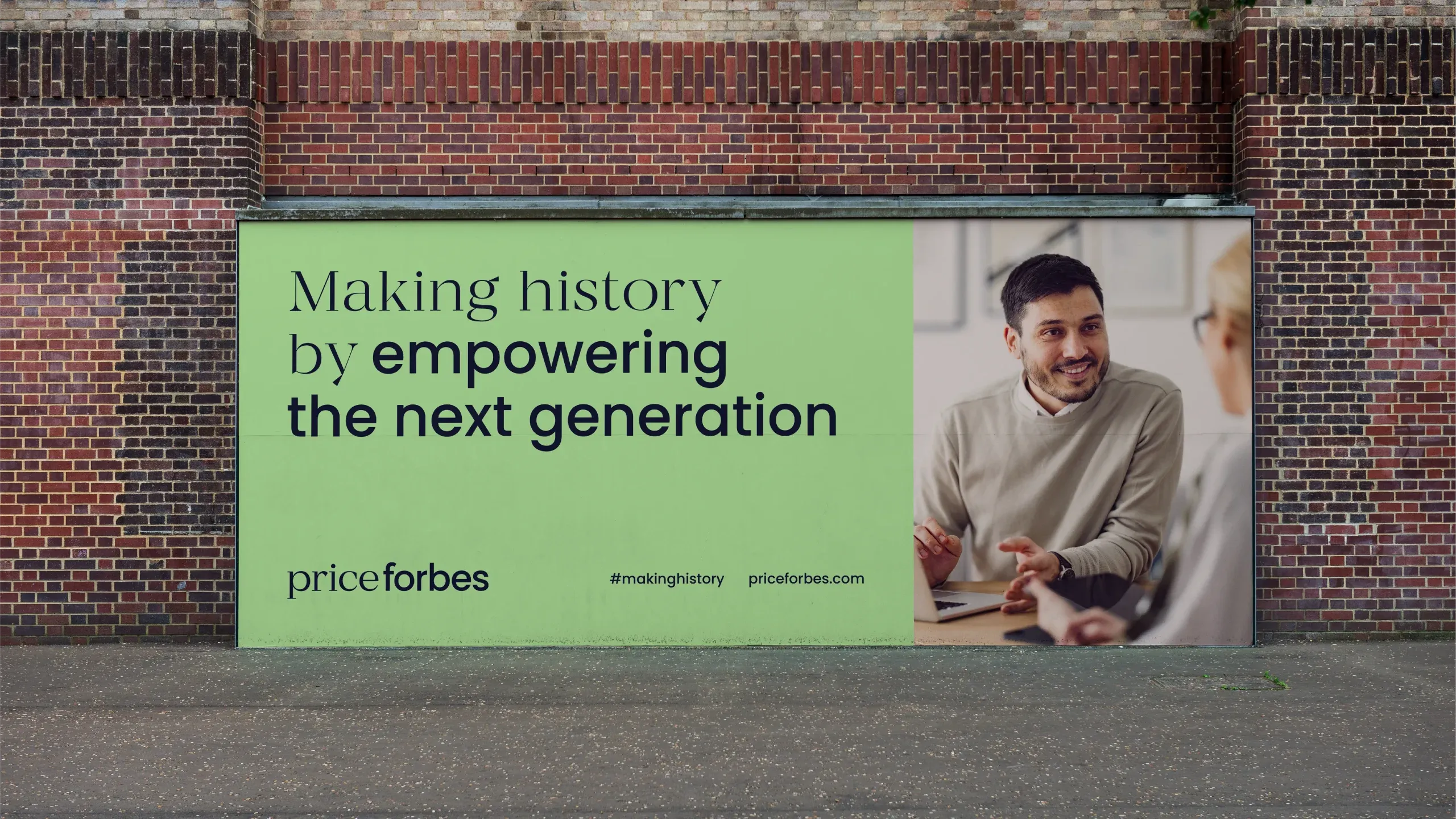
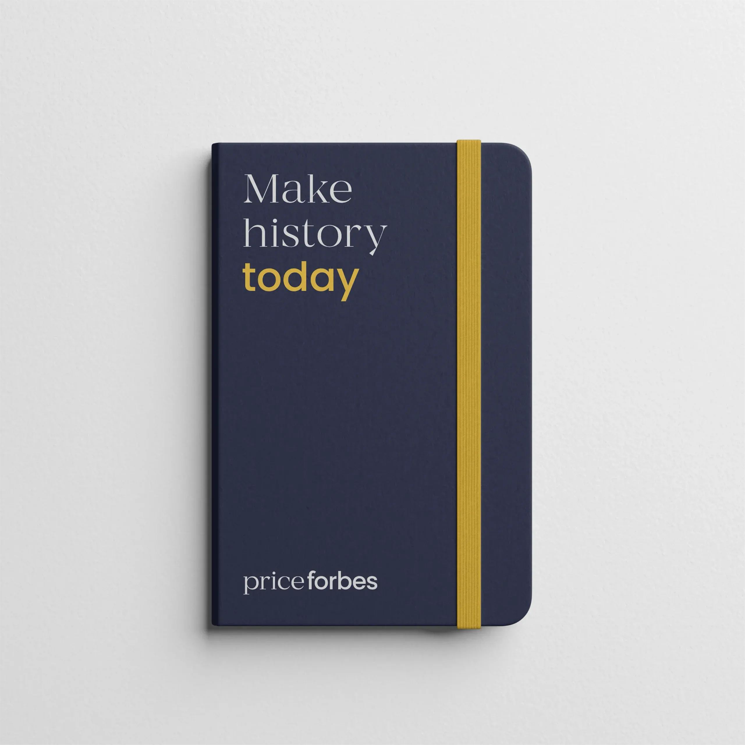
That led to our big idea: Making history. It embraces the business’s distinctive heritage and pioneering reputation while presenting it as open and forward-facing. It also speaks to how Price Forbes enables clients to make history their own way.
It set the stage for a confident, spirited tone of voice and a flexible linguistic device.
Solution
Our verbal identity established Price Forbes’s heritage as a pioneering business while, in the same breath, positioning it as future-ready, pushing for progress and empowering clients to break new ground.
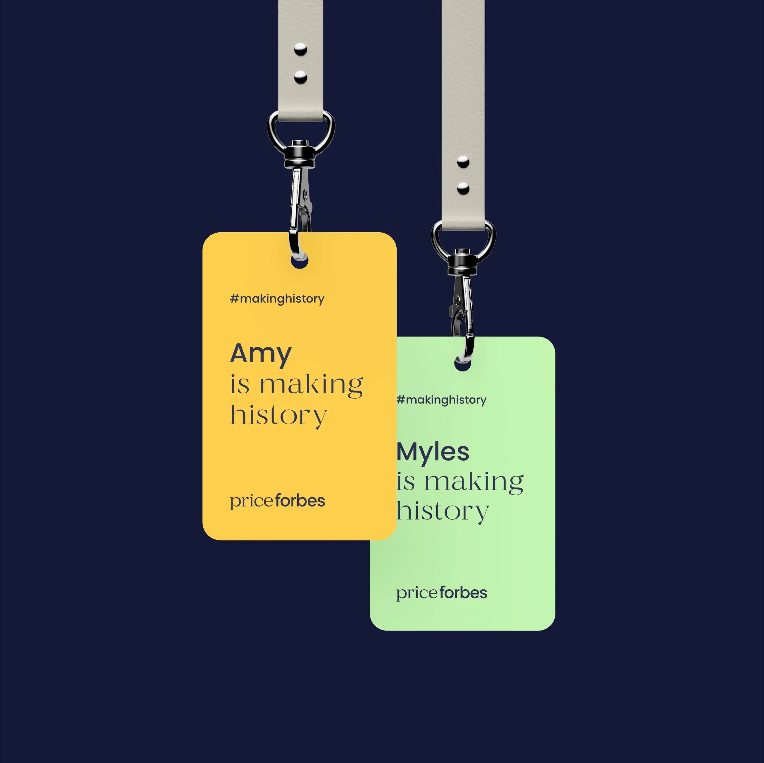
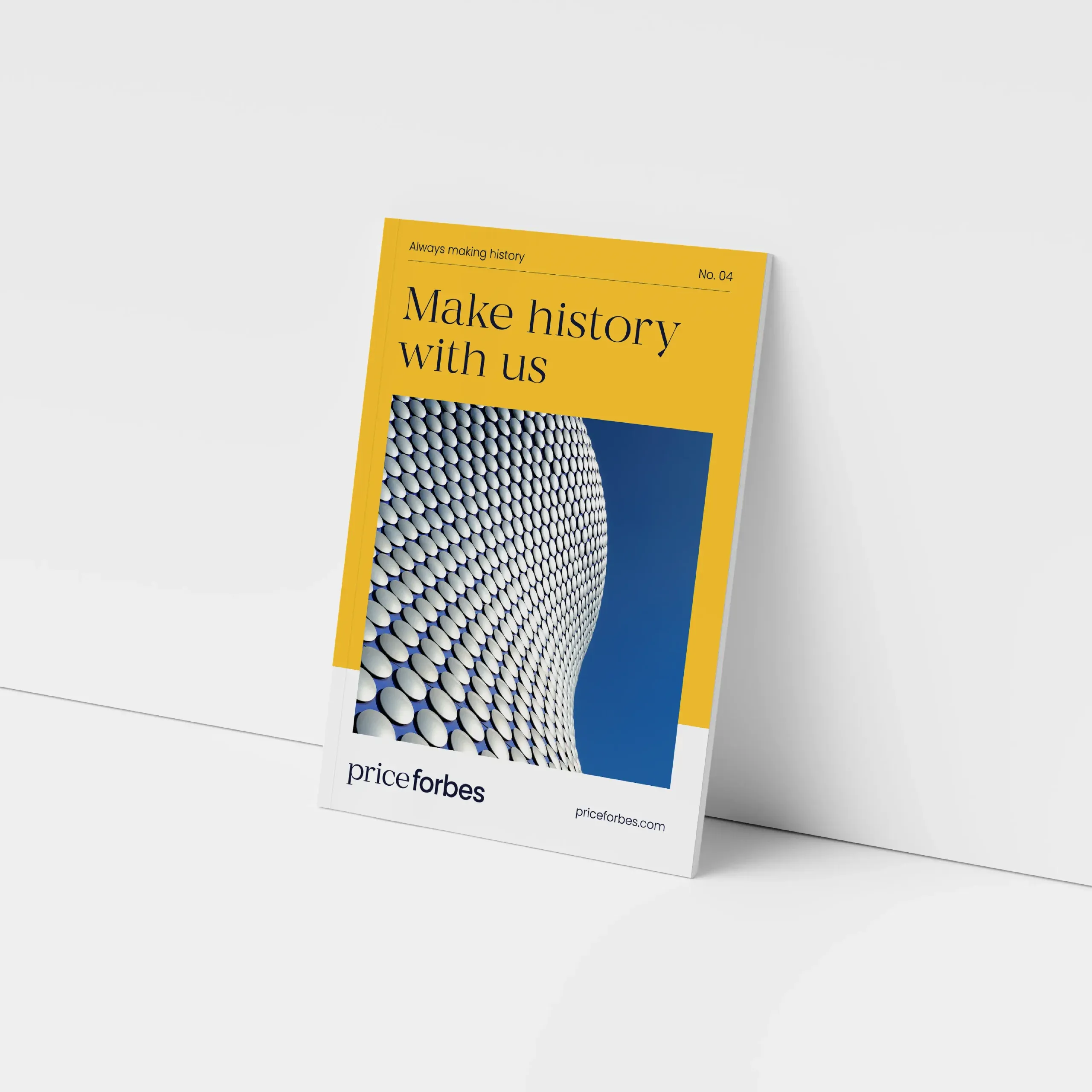
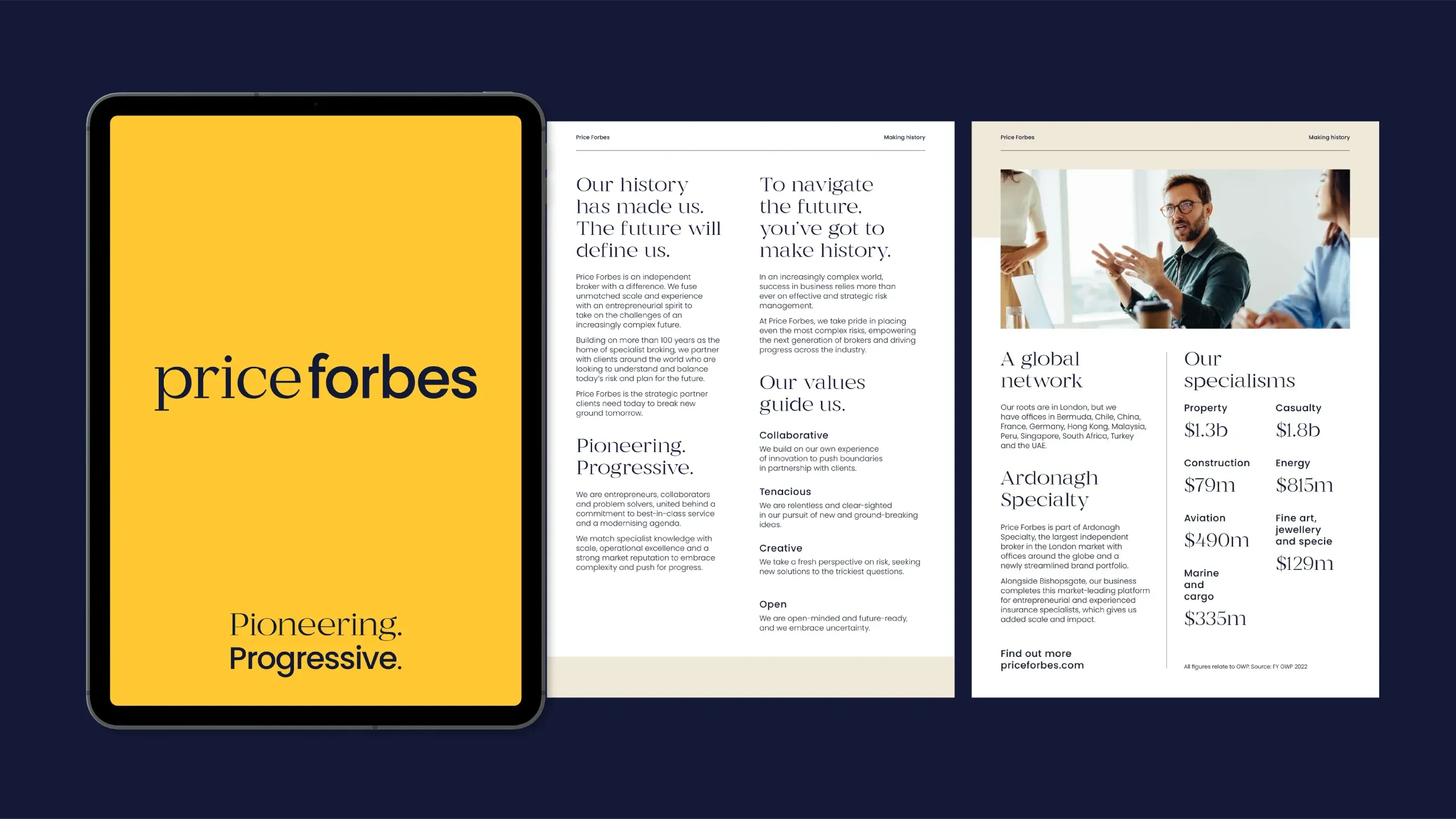
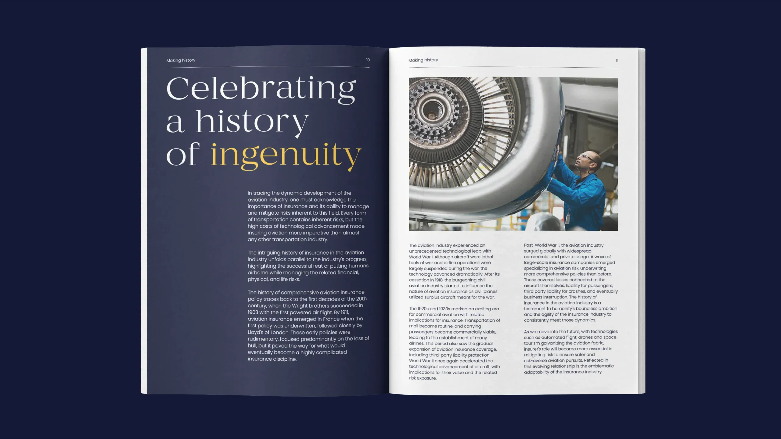
We carried that play between classic and modern into the visual identity, creating a vibrant palette that forefronts rich dark blue and warm yellow. We introduced a bold, differentiated typographic system, pairing a serif with a sans-serif font to capture heritage while looking to the future. We worked with font foundry Dalton Maag to refine the final logo, ensuring the fonts felt unified and worked across all sizes.
For the website, we created an editorial feel that matches the brand’s spirit, with bold type, interesting layouts and photography reflecting the modern outlook and diversity of the workforce.
Playful but refined, it positions Price Forbes as a sophisticated brand set to take on the future.
It was a pleasure to work with The Frameworks to craft a logo for this new, confident and refreshing brand. We worked within the creative parameters they had set, and collaborated closely with their team to refine the logo while maintaining its bold quality.
Riccardo De Franceschi, Creative Director, Dalton Maag
- Type of work
- Brand identity refresh and website
- Industry
- Insurance