The Dot GroupJoining the dots for a vibrant new brand
- Service
- Brand strategy and identity
- Industry
- Professional services
With three decades at the forefront of global student living, The Dot Group’s brand was out of step with the energy of the company. It was time for a fresh new look and feel – and a new name to boot.
Challenge
The Dot Group – formerly known as Capital Values Group – created the global student living sector 30 years ago, and has remained a market leader ever since. But its brand hadn’t kept pace.
This unique family of pioneering businesses, all focused on shaping a better future at every level of the student living economy, needed a new identity that would inspire and reflect the ethos of a company poised to take on the future.
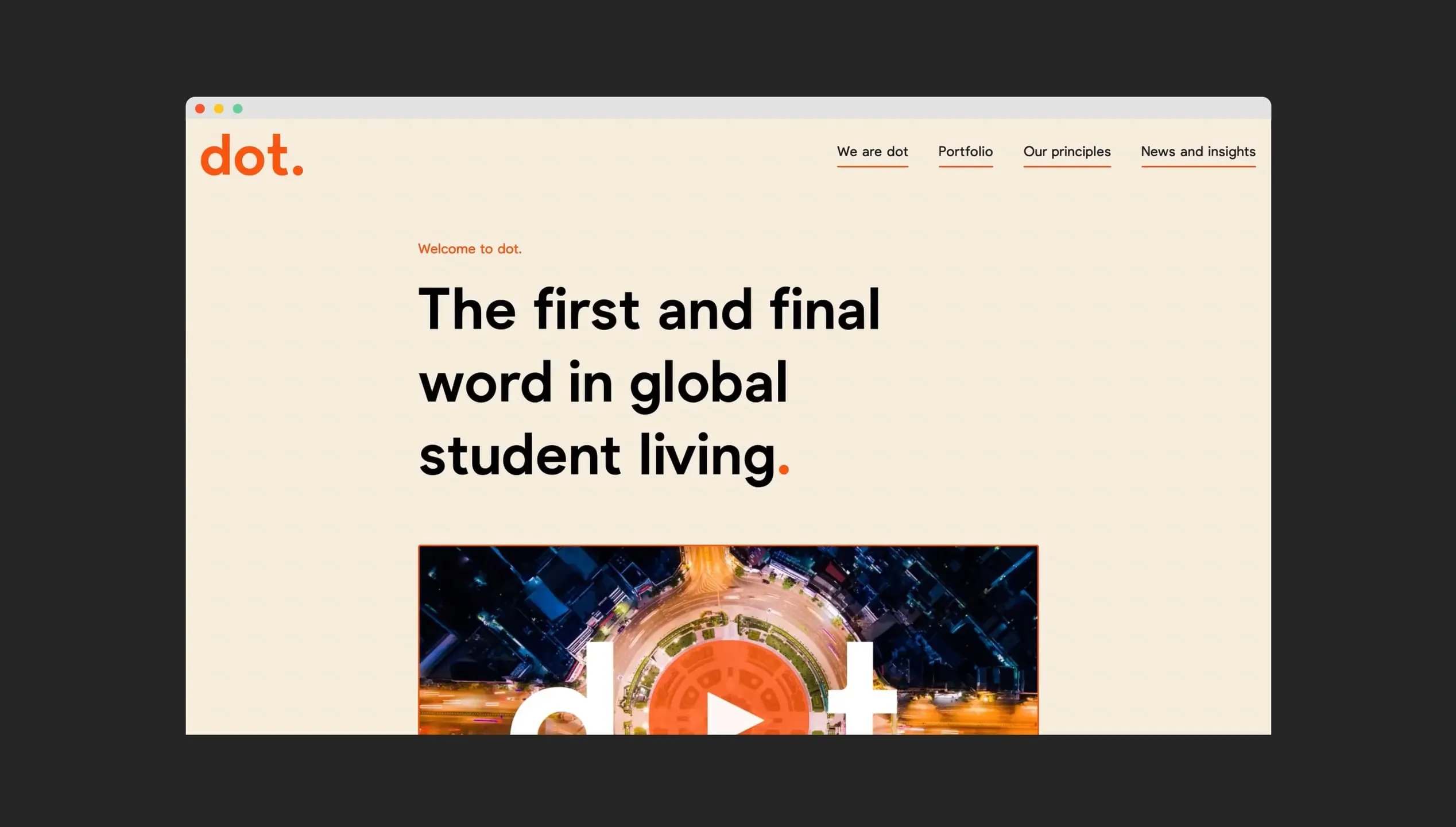
Our first brief was to design a brand strategy that would provide a clear narrative around the company’s function and purpose to the businesses within the wider family. The project evolved into creating a new brand, including a new name, website and launch materials.
Insight
To get an understanding of the current brand position and opportunities, we spoke to stakeholders including investors and employees from the family of businesses. We heard time and again that the company needed more clarity around its purpose.
But stakeholders were united in their excitement about the future, and their pride in being part of a winning team that makes a tangible difference to people’s lives. The company needed to harness this energy and optimism, and that of the students it ultimately serves.
We renamed the company Dot. A deceptively simple name that conveys the company’s position as the first and final word in global student living, connecting and capturing opportunities like no one else.
Solution
With the new name, Dot needed a look and feel to match. We were drawn to the simplicity of the circles present across its sub-brands, so put them at the heart of the visual identity, using the device to highlight, animate and connect.
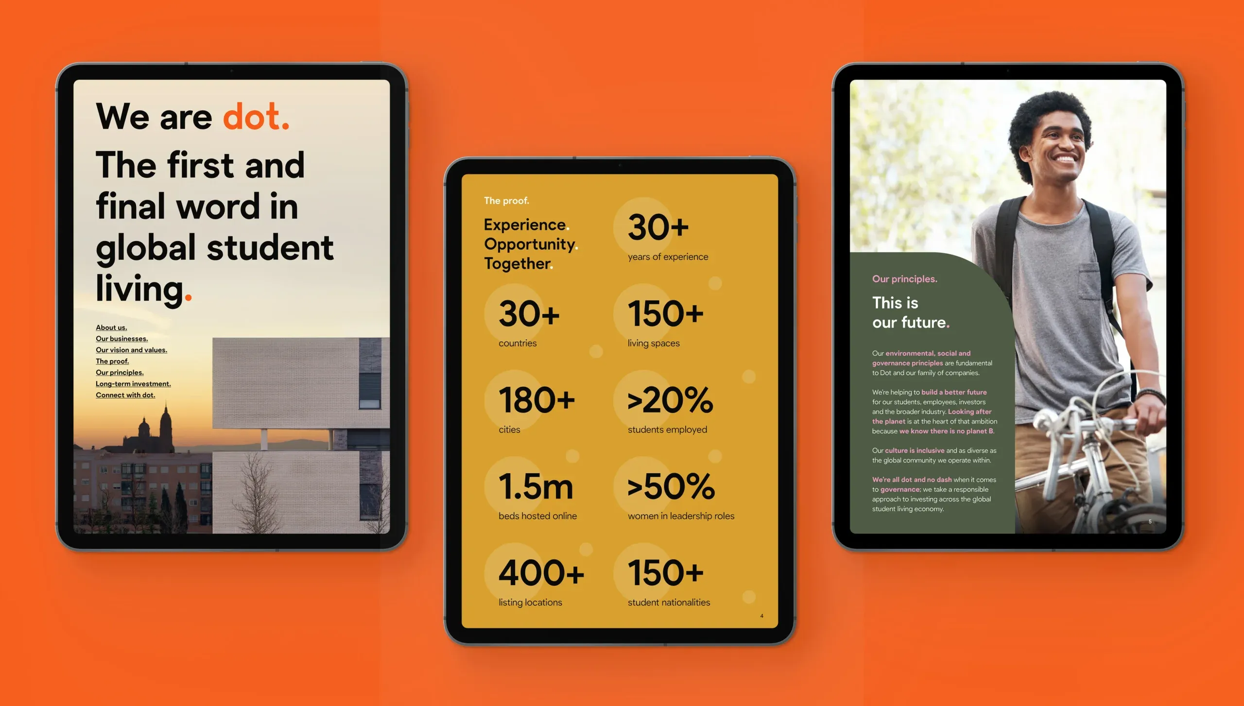
The Dot brand identity is straight-talking, vibrant and typography-led to emphasise the company’s position as the global standard for student living, leading the pack and bringing all the right elements together. Its playfulness, simplicity and confidence run through the verbal identity.
Paired with fresh, earthy colours, the Dot brand is as transformational as the company’s mission. We brought it to life across a new website and launch materials, giving the whole family of businesses a clear, shared story to rally around as they take on the future.