


Wates
Building a brand with care, legacy and leadership

Wates doesn’t just build places. It may be one of the UK’s biggest construction, development and property services companies, but bricks and mortar are just one piece of the puzzle: Wates builds trust, progress and prosperity for communities and future generations.
But in a competitive market shaped by rapid change and rising expectations, it was hard to see what made Wates different from the rest. It needed a cohesive story to unite its diverse business areas and convey a confident but caring brand to the world.
Giving it purpose
Wates challenged us to define and amplify its new purpose: Reimagining places for people to thrive. We needed to elevate the brand, inspire engagement and strengthen its leadership position across the built environment.
Our starting point was the company’s unwavering sense of empathy and responsibility, rooted in its family values and demonstrated through tangible, lasting impact. Wates strives to do work that is transformational, not just transactional.
Through stakeholder workshops and research, we uncovered a deep and genuine commitment to create places that nurture the security, inspiration and resources needed for long-term, positive progress. Seen through this lens, the brand purpose is both an invitation and a promise: a call to rethink what the built environment can do.


Flexing the message
We designed a strategic messaging framework around three complementary ideas that ladder up to and validate the brand purpose statement:
- We reimagine places: expressing Wates’ innovative, optimistic mindset
- We help people thrive: highlighting the human impact of Wates’ work
- We are grounded: reinforcing 125+ years’ worth of authenticity and expertise
The verbal identity covers a suite of creative copy that enables Wates to flex its voice across its diverse audiences.
A visual flourish
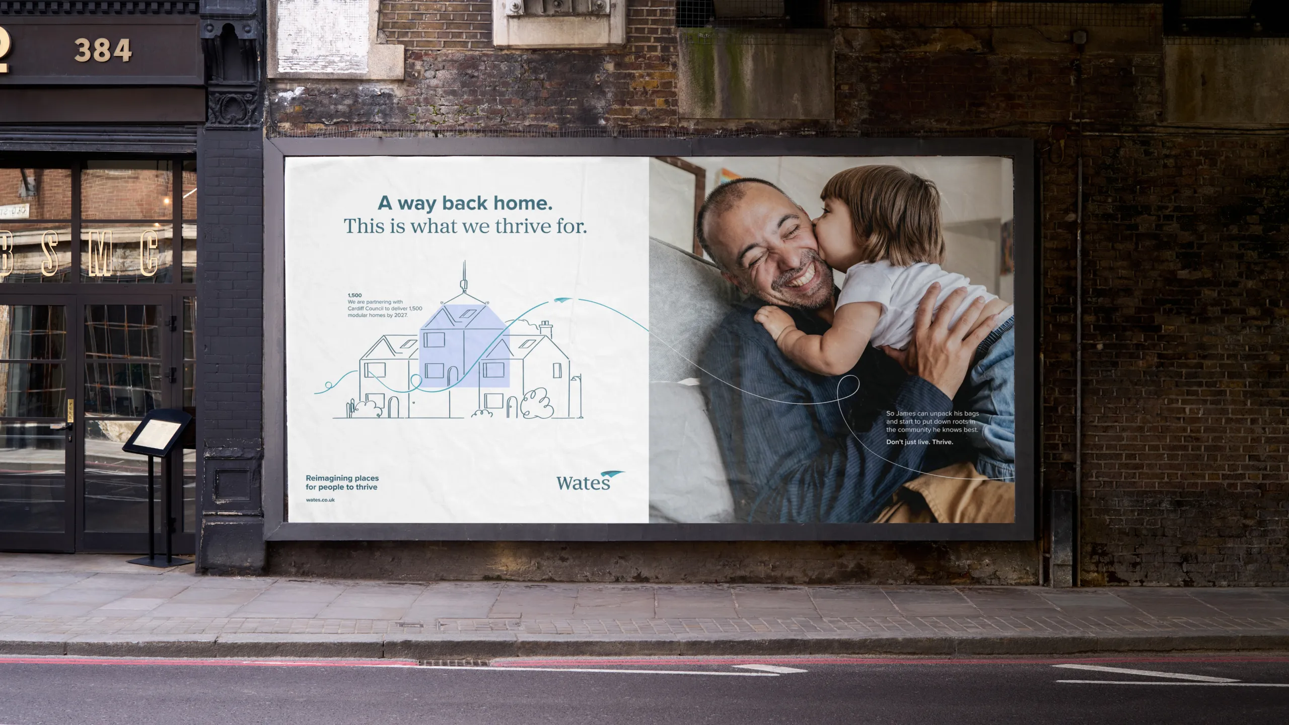
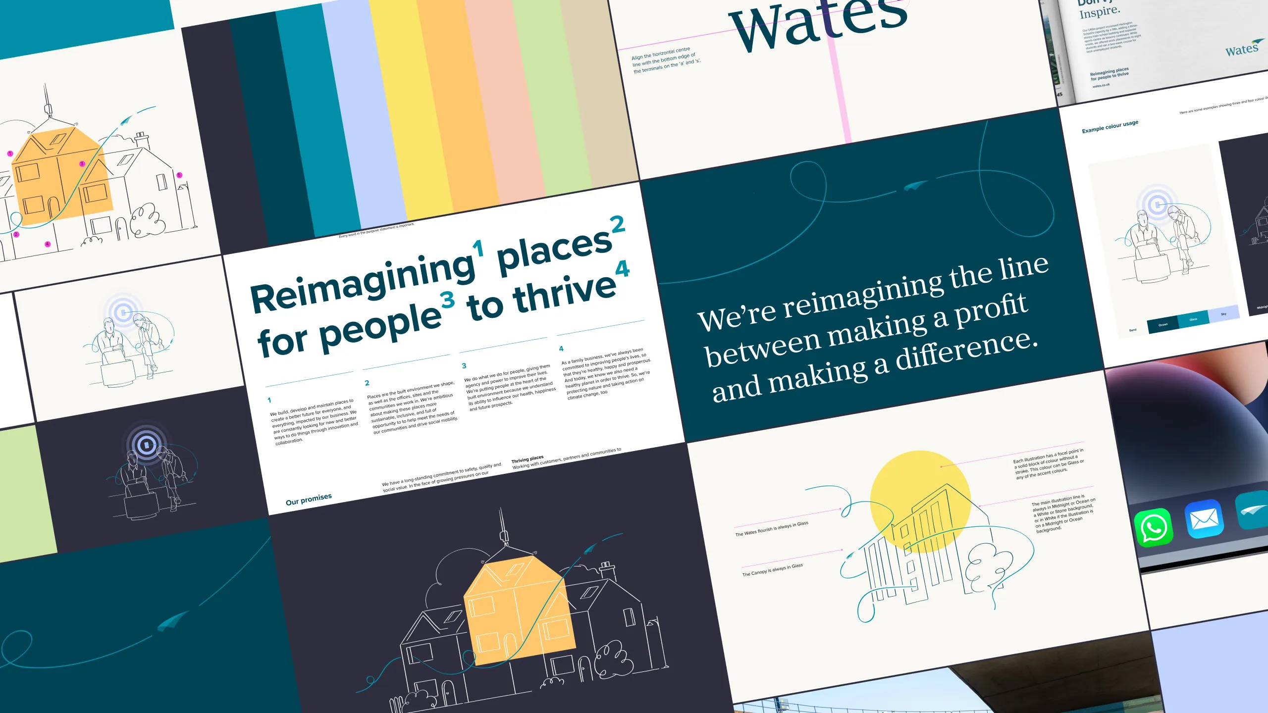
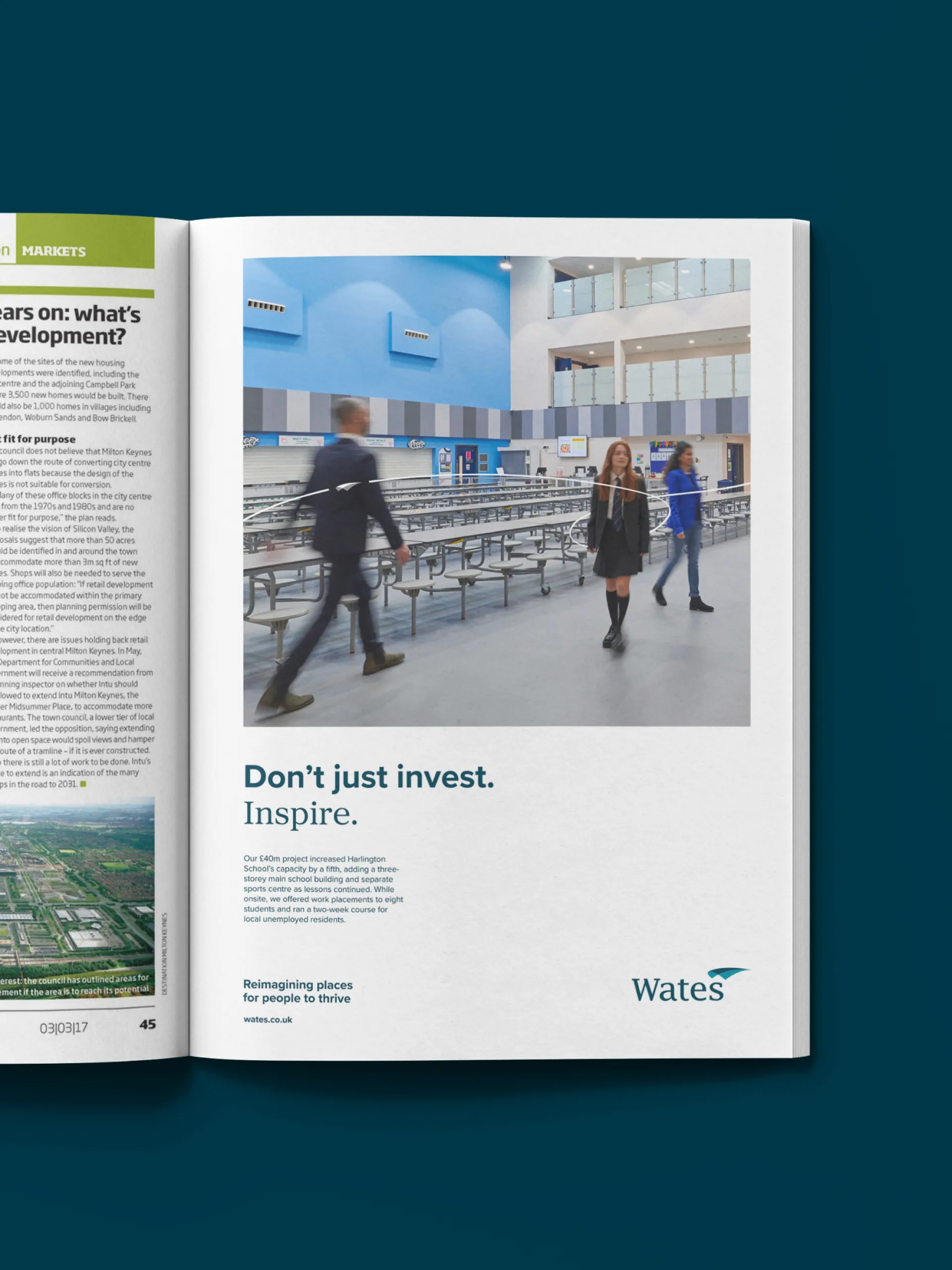
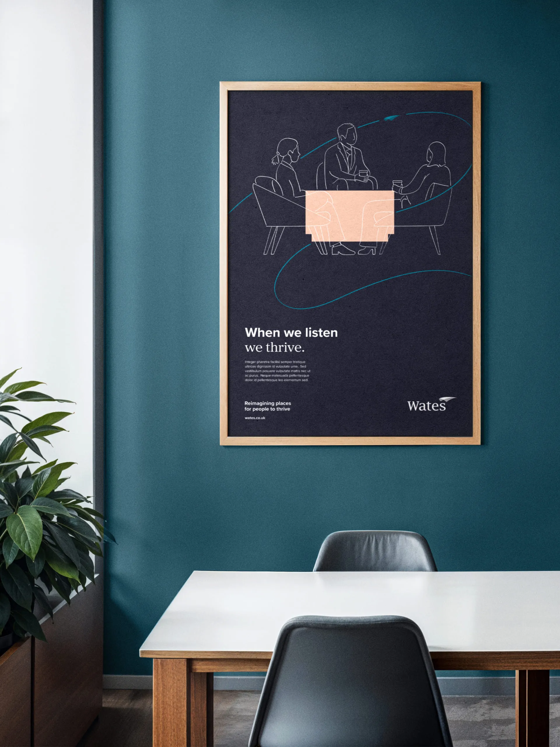
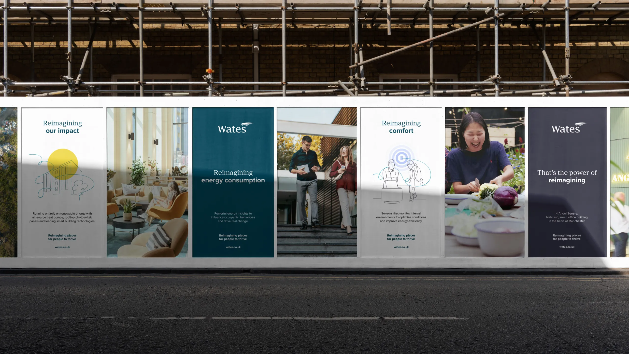
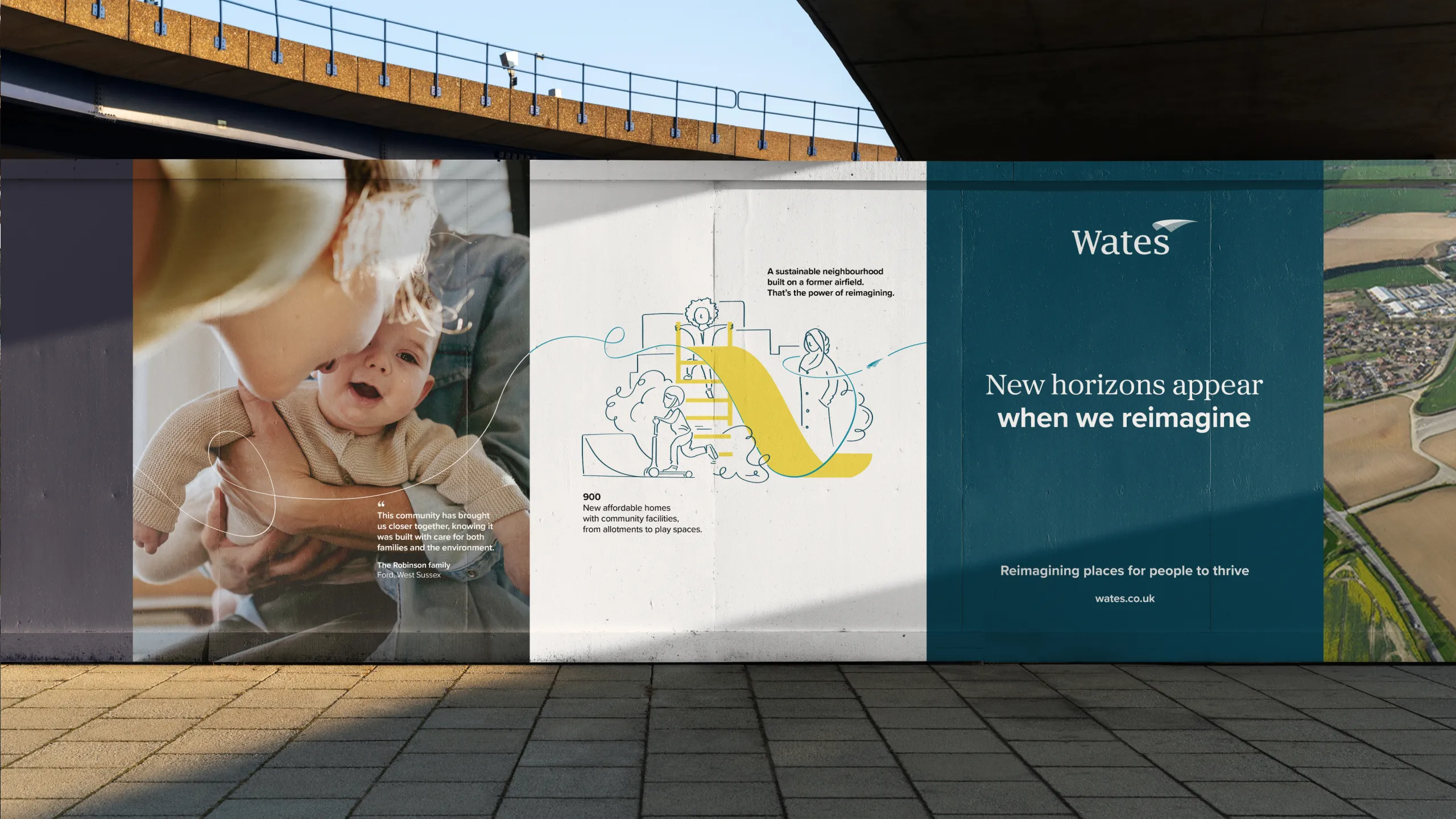
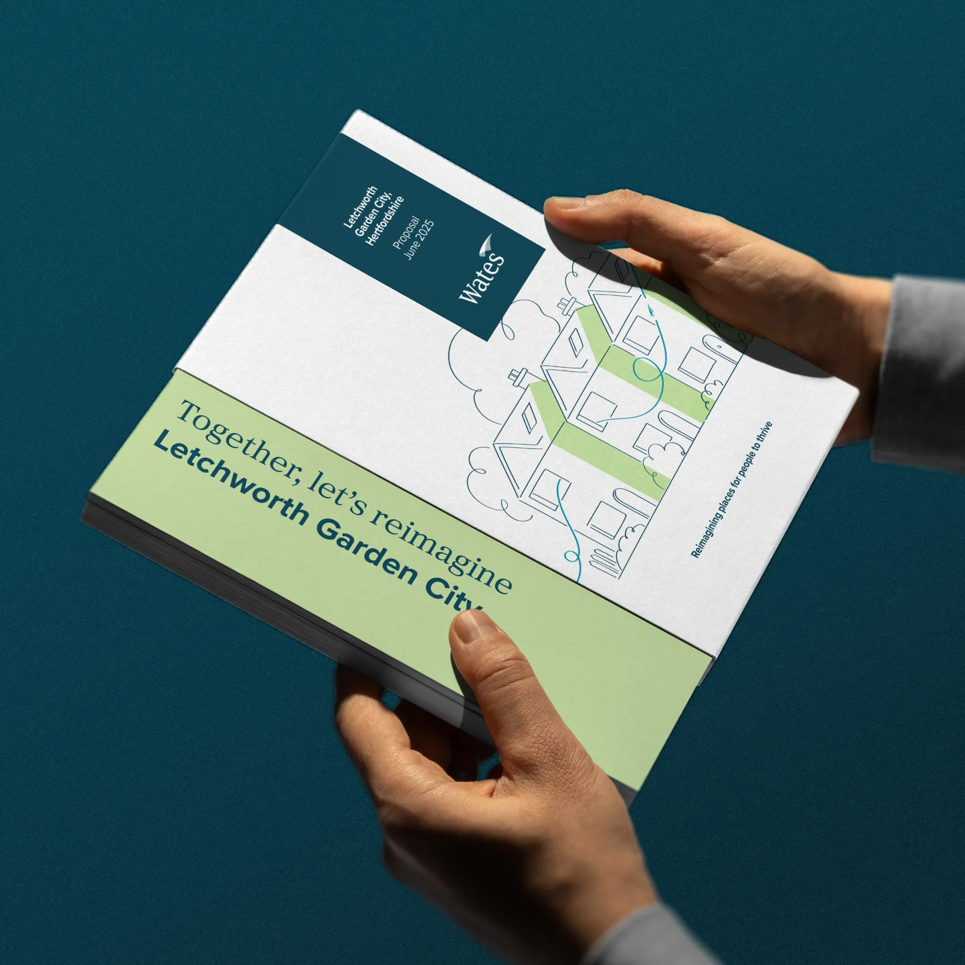
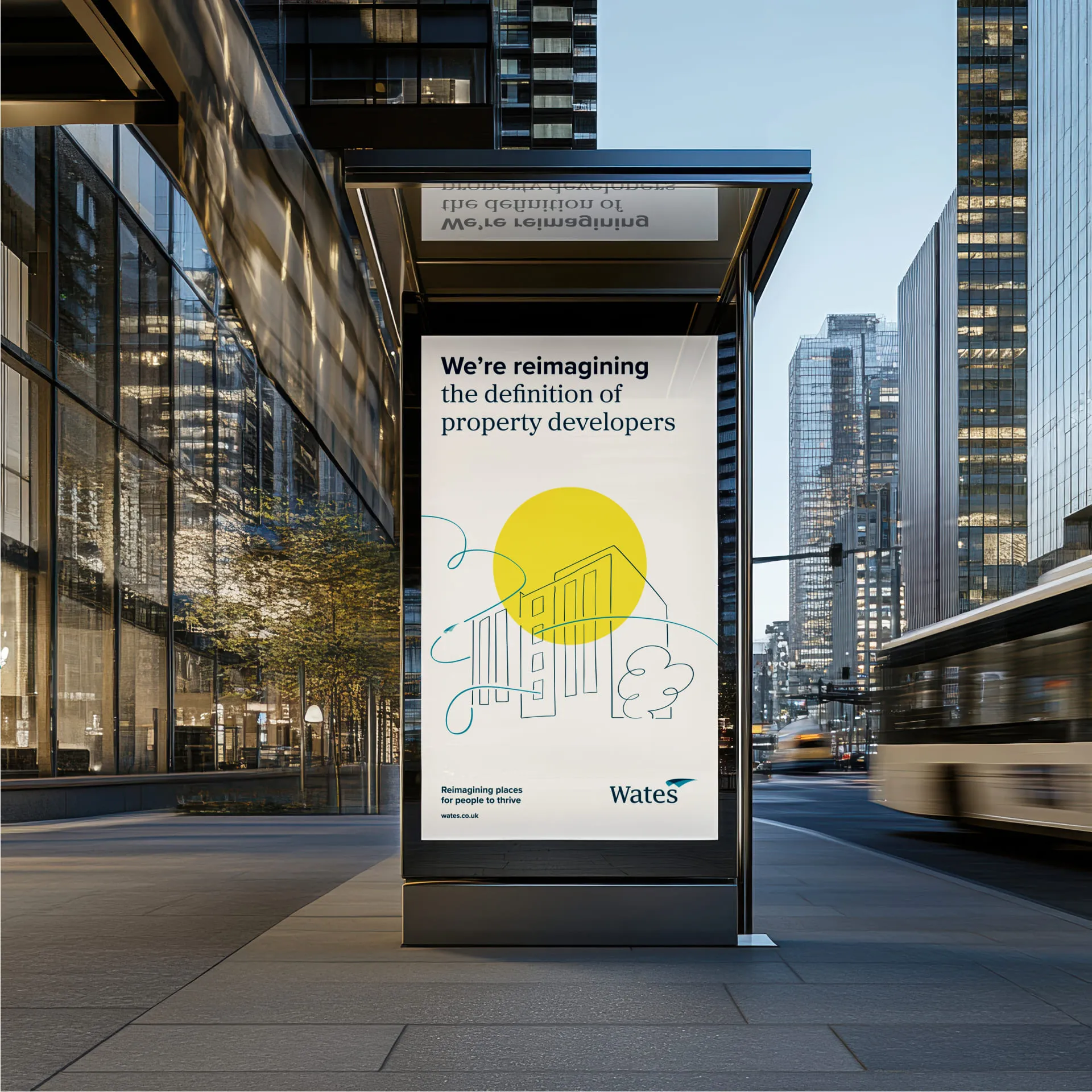
Meanwhile, the refreshed visual identity ushers in a more sophisticated and meaningful expression of the company’s history and purpose. We refined the colour palette and introduced more harmonious secondary shades for versatility. We softened and updated the typography, improving legibility and introducing an elegant complementary serif as a nod to the heritage.
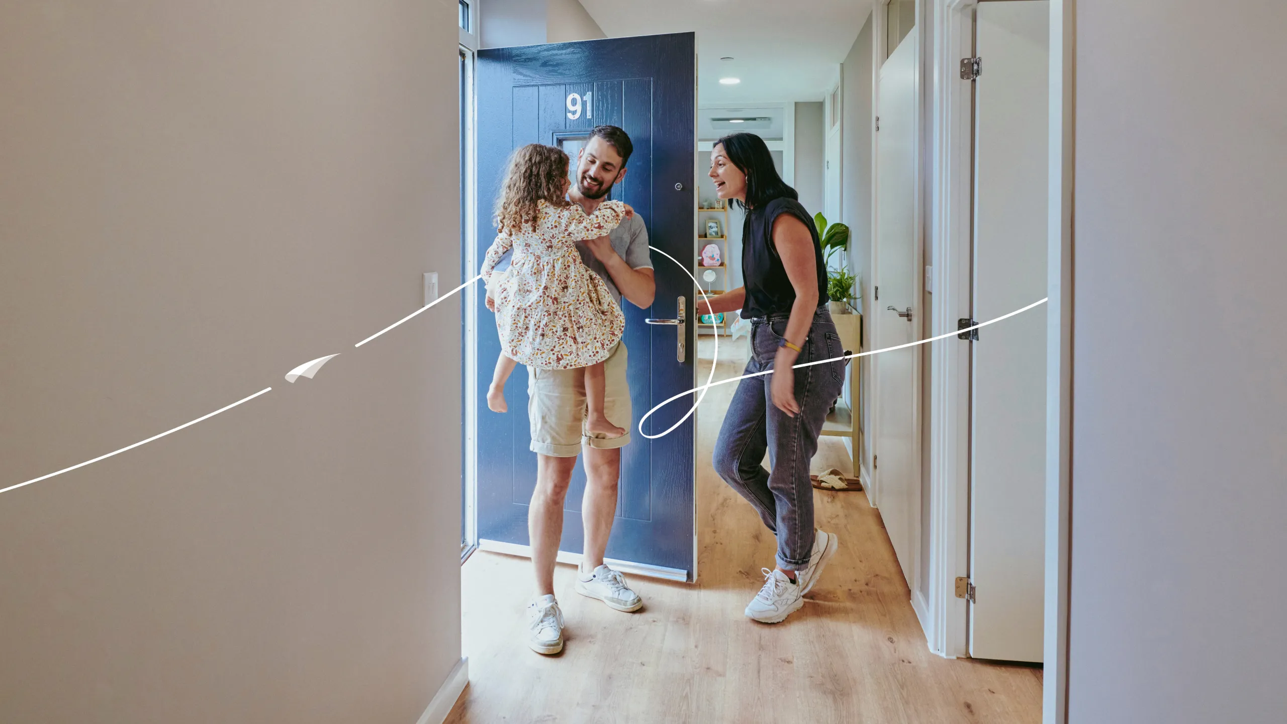
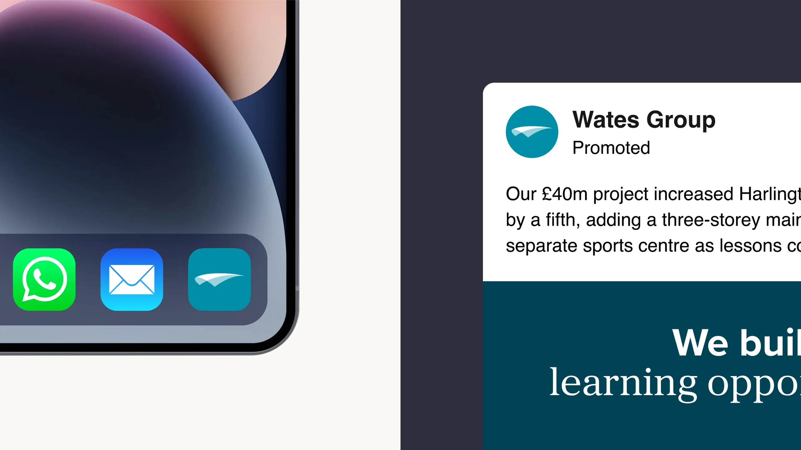
Visual storytelling now plays a central role through a reportage photography style that captures authentic, thriving moments across four thematic categories. A distinctive new illustration style offers greater flexibility and clarity. And the “Wates flourish” brings it all together, representing forward momentum and symbolising Wates’ integral role in the built environment.
The new visual and verbal elements came to life in a heartfelt brand film that captures the deeply human story at the heart of the Wates brand.
Jude Taylor, Head of Brand and Marketing at Wates, says:
“The Frameworks helped us unlock the full potential of our brand purpose. They guided us in shaping a clear messaging system and refreshed visual identity. Their mix of strategic thinking and creative instinct brought real consistency to how we tell our story across the business, making it feel joined-up, authentic, and unmistakably ours. Most importantly, they helped us use our purpose to define a stronger position in the market, one that’s true to who we are and clearly sets us apart.”
Louise Sheeran, Content Director, says:
“We didn’t have to dig very far to find stories that demonstrate the care and commitment at the heart of Wates’ brand purpose. It’s really satisfying to see how our verbal and visual frameworks are bringing these themes to the surface and telling the world what a difference Wates makes.”