How do we match the voice to the design?

A matched voice and design express the same brand qualities in different ways, so audiences get one clear idea wherever they meet the brand. Start with the qualities the brand needs to convey, then shape language, typography, colour, imagery and layout to support them rather than compete.

Voice and design should make the same promise

A strong verbal identity and visual identity system make the same brand promise, even when they use different tools. If the design is calm, precise and understated, busy or overly ornate language can pull the experience in the opposite direction. If the words challenge convention, the visual expression needs enough energy to carry that point of view.

The aim is not to make every brand touchpoint look and sound identical. The aim is to give website content, sales decks, product communications, social posts and customer materials a shared character, mood and set of values. Language can make an idea clear, while design makes that idea easier to feel and remember. Together, they help people understand not only what an organisation does, but what it stands for.

The useful test is simple: could the copy belong to the design, and could the design belong to the words? If the answer is no, the brand experience needs a closer look.

Sources: No creator is an island, Creating connections through design, WellSaid: Shaping the voice of an ethical AI leader

Build verbal and visual identity together, not in a relay race

Voice-to-design alignment works best when writers and designers develop the brand expression together from the start. A phrase from audience research or a stakeholder interview can spark a visual idea. A graphic approach, typographic choice or image style can also reveal the right tone of voice. Neither discipline should simply decorate work that has already been decided elsewhere.

Start with the positioning and the few qualities the audience should recognise, such as expertise, warmth, confidence or imagination. Then explore how each quality appears in language and design across real brand touchpoints. A bold visual system may need plain-speaking copy to give it room to breathe. A more restrained design may need more expressive language to add energy and humanity.

Use workshops and practical prototypes to find the balance. Review a headline, a web page, a presentation slide and a product message together. That back-and-forth turns a promising idea into a consistent brand experience.

Sources: No creator is an island, Designing an Authentic Emotional Connection, Creating connections through design

The clearest brands let words and design challenge each other

We believe voice and design should be developed as one creative conversation, not handed from one team to another. A visual identity can sharpen the language. A verbal idea can unlock the design. That healthy friction gives a brand more clarity, character and staying power than a set of disconnected guidelines.

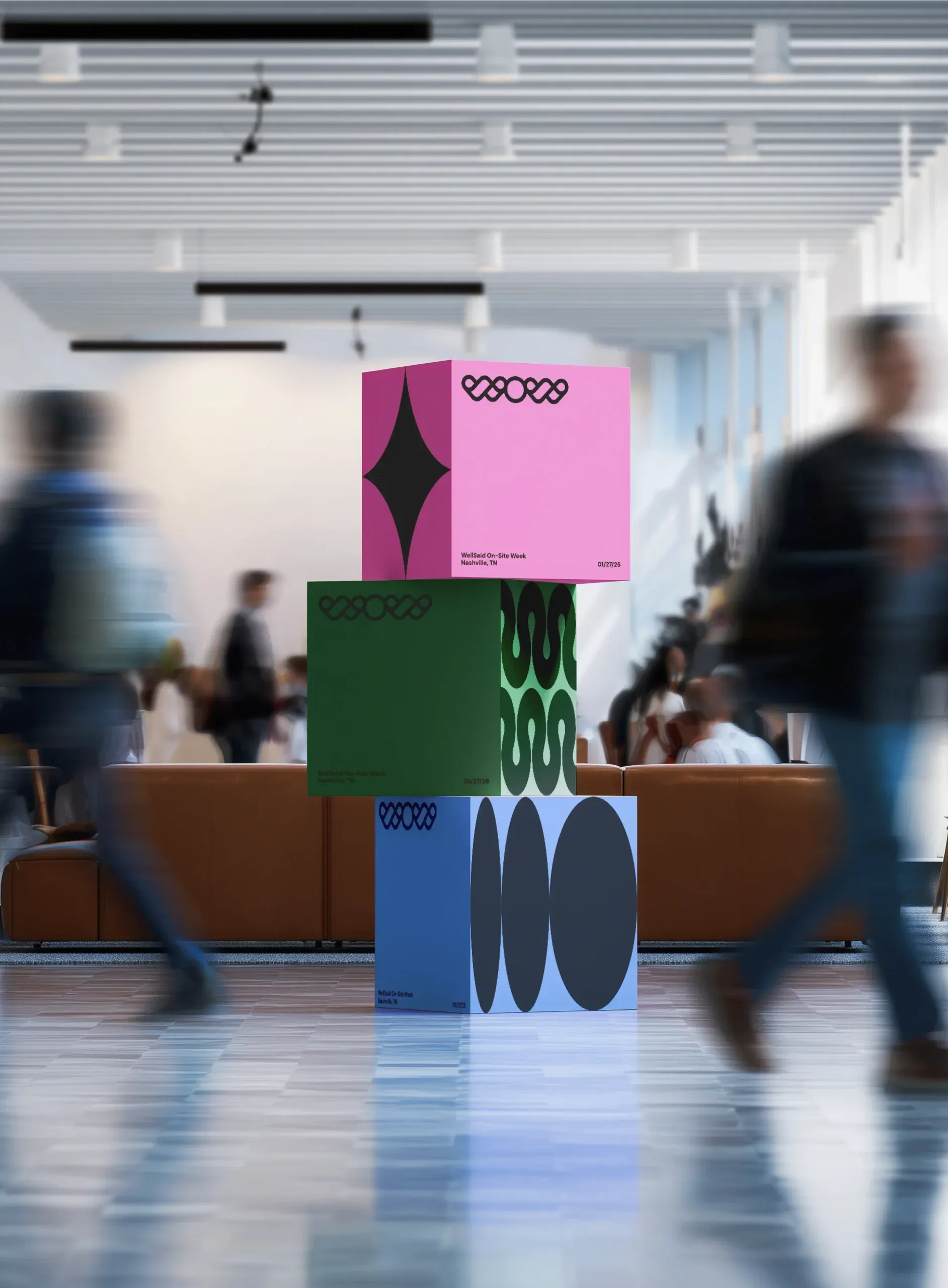
We have put that belief into practice for WellSaid, shaping language and design across website content, video scripts, social ads, community badges and internal activity. The work reflected the same qualities at every turn: authenticity, trust and quality. We have also paired vibrant colour, graphic patterns and human-led photography with language that made engineering feel more human for Tata Technologies. The point is not visual polish or clever copy alone. It is one coherent idea, made useful wherever people encounter it.

Sources: WellSaid: Shaping the voice of an ethical AI leader, No creator is an island

Stats

A peer-reviewed measurement framework identifies 3 elements of integrated communication: message consistency with strategic positioning, consistency of visual communication components, and consistency between product and service messages.

Journal of Marketing Communications

FAQs

Should the copy and visual design always be equally bold?

No, copy and design do not need to be equally bold to feel connected. Sometimes one element should step back so the other can do its job, such as plain language supporting an expressive visual system. The important thing is that both elements reinforce the same character and message.

Can words shape the visual identity?

Yes, a phrase, audience insight or idea from stakeholder conversations can provide the spark for a visual identity. Design can also lead the way and help define the right verbal identity. The strongest work comes from an ongoing exchange between the two disciplines.

Which brand touchpoints should use the same voice and design?

The shared brand idea should carry across the places where people form an impression, including website content, advertising, video, social assets and internal materials. Each format can adapt to its audience and purpose without losing the core qualities that make the brand recognisable. Consistency comes from a common character, not repeated execution.

How can design make brand messaging easier to understand?

Design can turn an abstract message into something people can relate to, navigate and remember. Typography, visuals, layout and accessibility choices all influence how people interpret a story. Clear design helps audiences access information and engage with the message behind it.