How do we create an emotional connection through brand design?

Create an emotional connection through brand design by understanding what matters to the audience, then expressing that understanding through messaging, typography and visual cues. The design does not need to be elaborate: words and typography can be enough. Keep the expression consistent across applications while adapting it to each context.

Start with the audience, not the visual treatment

Emotional connection through brand design starts with research into the audience and what matters to them. That understanding informs the idea, which can then be explored in workshops to determine how best to communicate it visually and verbally. Graphics, typography and messaging work together rather than as separate layers of decoration.

The relevant visual cue is not always an obviously emotional image. In a website project aimed at developers, The Frameworks incorporated coding elements into the front-end design to signal an understanding of the audience's language. The connection came from recognition: details that might mean little to another viewer could resonate with a developer. This approach makes audience understanding the basis for design decisions, rather than assuming that the same visual treatment will connect with everyone.

Sources: Designing an authentic emotional connection

Let typography carry the message

Typography can lead brand design when the words themselves express the central idea. Stripping back other design elements can give the message room to work. For IBM's Inclusion Week, The Frameworks used a simple approach in which typography carried emotional weight. For This Run, Tata Consultancy Services' marathon sponsorship programme, research identified the human reasons people run and raise money. Bold typography expressing those reasons became the strongest approach.

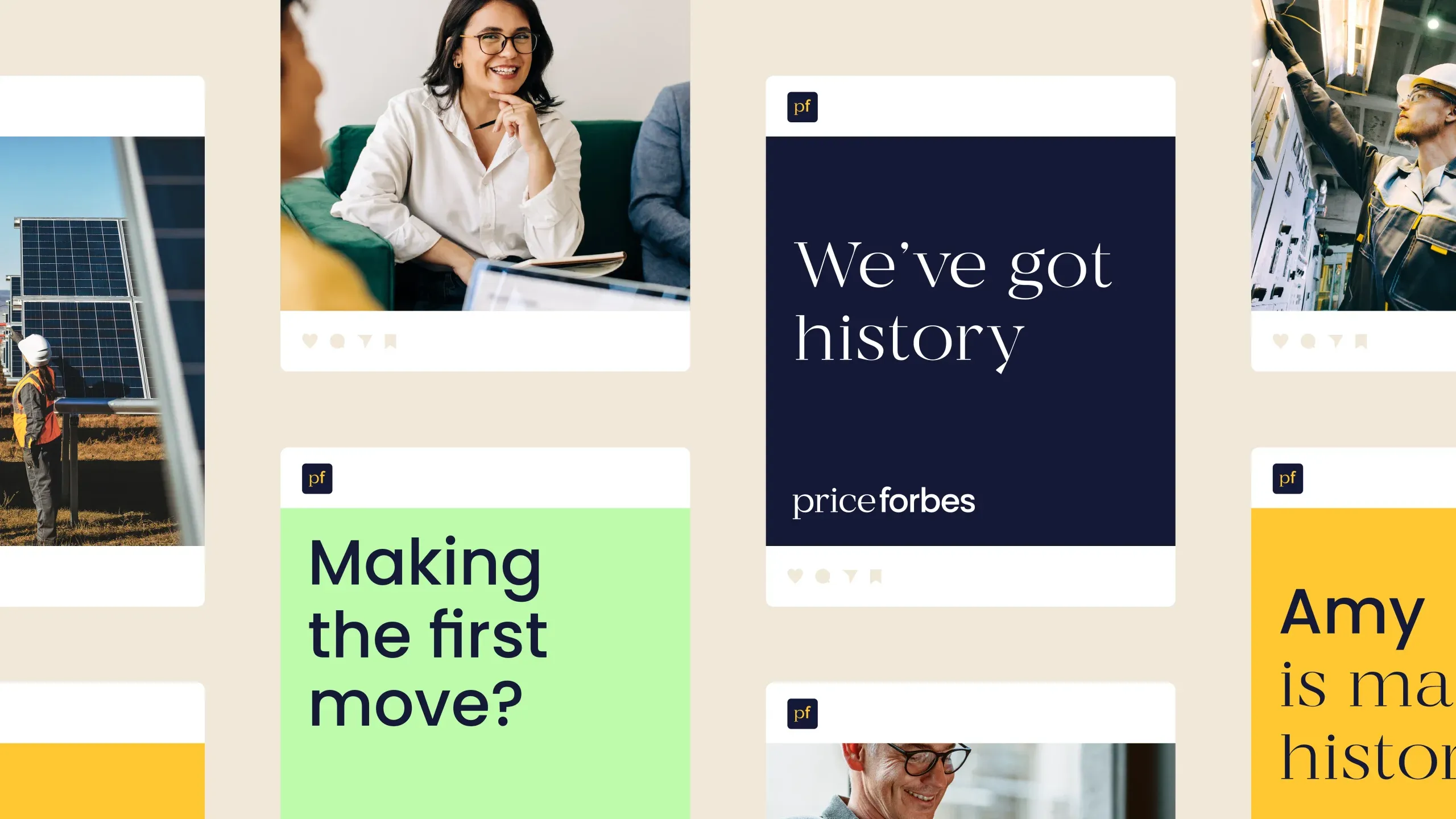
Typography can also communicate a brand's character through the relationship between letterforms. For Price Forbes, The Frameworks paired serif and sans-serif fonts to balance heritage with a forward-looking identity. Dalton Maag helped refine the final logo so the fonts felt unified and worked across sizes. These projects show different roles for typography: foregrounding human motivations or expressing the balance at the heart of a brand.

Sources: Designing an authentic emotional connection, Price Forbes: A bold brand for a new era of insurance

Build a connected visual language across applications

A connected visual language allows different assets to express the same brand without making every application identical. The relationship between the design and the brand's purpose remains important as the work moves into social advertising, community materials and internal communications.

For WellSaid, The Frameworks began with social ads built to the brand guidelines and a Canva ad template that internal teams could use to create their own posts. The work later included badges for WellSaid Legends, using the logo's "w" to form a heart reflecting its customer community. The standalone identity for WellSaid Offsite Week borrowed from the existing design language but introduced bolder colour and icons for a more playful internal setting. Each application had a distinct purpose while remaining connected to WellSaid's wider identity.

Sources: WellSaid: Shaping the voice of an ethical AI leader

Use print to create a physical browsing experience

Print design offers a physical encounter with a brand as well as a way to present information. A reader can experience texture, weight, colour and binding while browsing a curated sequence of content. That makes the object itself part of the communication, not simply a container for words and images.

The BECK brochure uses this approach to showcase work through browsing rather than by answering specific audience questions. Readers can encounter projects that inspire them to expand or change their initial idea. For The Estorick Collection, The Frameworks unified the visual identity across the website, exhibition materials and collection catalogues. The continuing work includes exhibition leaflets and London Underground posters, including those for the Giorgio Morandi exhibition. These applications extend the gallery's identity into physical encounters with its art and exhibitions.

Sources: Print isn’t dead: The power of print in reshaping user experience, The Estorick Collection at 25

Stats

FAQs

When should typography lead our brand design?

Typography should lead brand design when the words express the central idea most powerfully and other visual elements would distract from the message. For This Run, Tata Consultancy Services' marathon sponsorship programme, research uncovered the human reasons people run and raise money, making bold typography an effective way to express those motivations. The Frameworks' work on IBM's Inclusion Week also used a simple approach that allowed typography and messaging to carry the emotional connection.